
よくある質問
Table of Contents
General
Update: April 2025
What has changed in the latest version?
Updated Release Schedule as of April 2025
What are eBird Status and Trends data products and visualizations?
Can I contribute data to the eBird Status and Trends project?
Can eBird Status and Trends be used for commercial applications?
Are eBird Status and Trends data products taxonomically complete anywhere in the world?
Abundance
How is relative abundance defined?
How is “Percent of seasonal modeled population” calculated?
What is “Percent of modeled continental population” and how are continents defined?
What are EEZs?
How frequently will the web-based relative abundance maps be updated for Bald Eagle and Golden Eagle? We don’t want to state our assessments are based on the most recent data, and find they are not. Is there a scheduled cadence of updates?
What is the spatial resolution of the relative abundance maps?
What are “Custom shapes stats”?
Range
How are species’ ranges defined?
How is “Percent of region occupied” calculated?
How is “Percent of seasonal modeled range in region” calculated?
How is “Days of occupation in region” calculated?
Trends
How are Trends defined?
How are Trends estimated?
What are the Trend uncertainty estimates?
Why does the size of the circles vary on the Trends maps?
Why are trends available for only one season?
Why are trends not available for all species?
Why are trends limited to a portion of a species range?
What are the “modeled seasonal ranges” for eBird Trends?
Why do some species have a different start year for eBird Trends?
Where can I learn more about how to analyze and use Trends data products?
What Trends data are available for download?
How are trends regional summaries calculated?
Why do trends I’ve accessed via the Science paper look different from those on the eBird Status & Trends website?
Technical
What modeling methods were used?
Which eBird data were used to generate the Status and Trends data products and visualizations?
What environmental data were used for the Status and Trend data products and visualizations?
How are seasons defined for each species? Why are there gaps between seasons?
Why are pre-breeding and post-breeding migrations sometimes separated?
What is the difference between “modeled area” and “no prediction”?
Why are some islands areas of “No Prediction”?
Some of the maps have errors? Why does this happen?
Why do some products show as “Unavailable” or cannot be clicked on?
Can I download the data?
How do we ensure that the eBird data are accurate?
What happened to the eBird Status and Trends Data Products from previous years?
How do the maps match what we know about each species’ biology?
Why does an eBird Status and Trends taxonomic concept not match with elsewhere on the eBird website?
Why are there different versions of eBird Status products on the website?
How are ocean species modeled?
References
General
Updated: April 2025
The April 2025 release includes updated eBird Status visualizations and data productions for 2,974 full species, estimated for the year 2023. The previous version of the eBird Trends estimates (ending in 2022) remain on the website and have not been updated. After taxonomic updates, there are 842 full species with trends visualizations and data products available. There are no longer mixed versions of eBird Status products, as all species from the last version (2022) and all but 381 species from the 2021 version have been updated. For those 381 species (mostly European, Indian, and Central Asian), the species-specific URLs remain directly accessible and data products can be downloaded from those pages, but those species are not searchable and are not available for download via the latest version of the R package.
What has changed in the latest version?
At a broad level, the biggest changes this year are the number of species modeled and the efforts made to achieve near taxonomic completeness in North and Central America (through Panama), Chile, and New Zealand. For a summary of this year’s taxonomic completeness in those regions read that FAQ item. We have also added a suite of ocean-related covariates and restructured the workflow to model relevant species over both land and ocean, in an attempt to provide at least inshore coverage of species that are highly pelagic during at least some part of their lifecycle. Read more about modeling ocean species here.
At a more technical level, changes have been made to the way the range boundary estimates are made to improve their quality, simplify the way they are modeled, and make them easier to interpret. Similarly, count estimates have been improved (and their estimated values have increased) with changes to that model. For a full, detailed, technical documentation of changes in this year’s version, please see the Changelog. Some important changes are summarized here:
Status
- The Global Mountain Biodiversity Assessment (GBMA) of mountain ranges was included as a covariate to improve predictions of montane endemics that are restricted to only one or a few ranges of mountains.
- Ocean covariates, bathymetry, bathymetric slope, monthly chlorophyll, monthly sea surface temperature, and monthly sea surface temperature, we added to improve the predictions of coastal and oceanic species.
- Intertidal mudflat covariate was removed from the model, as the data are no longer being updated.
- Range boundary estimates have been substantially improved by adding a binary classification model (very similar in nature to existing occurrence model, except that it predicts 0 or 1, as opposed to probabilities between 01 and 1) to specifically estimate cell-wise presence/absence. As a result, the range boundary estimate effort units now match the occurrence and count estimates of 1 hour and 2 km. Upsampling detections to maintain a minimum detection rate in training the occurrence model has been dropped and not included in the binary classification model. At an ensemble level, the interpretation of presence is that more than half of the models making estimates at a given location predicted it to be present. For more detailed info on these changes, please see the Changelog.
- Previously, the count model included checklists that were predicted to be present by the occurrence model, but having an observer count of zero. These have now been removed from the count model. As a result, the count estimates are much higher and indices of model performance have improved.
- We have transitioned to a new 3 km X 3 km prediction grid in the widely accepted Equal Earth equal area projection.
- A suite of changes have been made to improve the range-boundaries at the ensemble-level, resulting in better boundaries and computational performance improvements. We are now able to model range-restricted species much better.
- The method for the summarization of confidence intervals for occurrence, count, and relative abundance estimates has been changed from Geyer subsampling to simple 90th and 10th quantiles of estimates in the ensemble.
- The suite of Predictive Performance Metrics (PPMs) has been significantly overhauled and expanded. For more info see the Changelog.
- Regional Stats
- Proportion of Population is now available for both global and continental modeled populations. For info on continent definition see that FAQ item.
- Exclusive Economic Zones (EEZs) have been added as regions available for summary statistics for species that are modeled over both land and water.
- On a species’ download page, under “Abundance Downloads” it is now possible to download all 52 weeks of abundance data as one zipped GeoTIFF.
- Weekly 3km raster products describing data coverage (mean spatial coverage and site selection probability) are now available in the R package.
Updated Release Schedule as of April 2025
As of April 2025, we are updating our release schedule and transitioning to a staggered release schedule. This will support significant updates to our analytical approaches and enhance the scientific foundation of our work.
Release Schedule and Methodology Updates:
Fall 2025: There will not be any new data release this year after the April 2025 Status release.
2026: We will publish the final version of Status that uses current methods.
2027: A new version of Trends will be released. This version will focus on better estimates of inter-annual variation in population trends.
2028/2029: A new version of the Status product will be released, utilizing a Joint Species Distribution Model (JSDM) framework. The JSDM framework will be able to take advantage of species interactions when estimating occurrence and abundance, and will allow greater flexibility to incorporate new features in future iterations.
We understand these changes may impact your workflows and analyses, and we are committed to providing detailed documentation and support as these transitions occur. If you have any questions or require further information, please do not hesitate to reach out.
What are eBird Status and Trends Data Products and visualizations?
The eBird Status and Trends Data Products provide basic ecological information for more than 2900 species globally, describing their ranges, abundances, and trends. To generate the visualizations, we use statistical and machine learning analyses designed to combine eBird data with a range of environmental data. The analyses are used to predict the occurrence, abundance, and trends in relative abundance of species across the globe at weekly intervals. These predictions are the cornerstone of the Status and Trends Data Products and are summarized in several ways to produce the different visualizations.
Currently available eBird Status and Trends visualizations:
- Weekly Abundance represents weekly relative abundances, revealing movements of a population throughout the year.
- Seasonal abundance maps indicate the average relative abundance of a species in each season of their annual cycle.
- Range maps show species seasonal range boundaries, similar to traditional range maps.
- Regional stats tables show mean relative abundance, percentage of the seasonal population, percentage of the region occupied, percentage of the range in region, and days of occupation in region for countries, territories, and dependencies, and subregions within.
- Trends show the change in relative abundance over the past 7-11 years (depending on region) at 27km x 27km pixels for either the breeding or non-breeding season.
Different visualizations require different volumes of data and the most data-intensive ones are only available for some of the species and seasons. We only present visualizations for species and seasons that have passed analytical and expert quality review tests.
Can I contribute data to the eBird Status and Trends project?
Yes, any eBirder can contribute! eBird Status and Trends is only possible thanks to the eBird submissions of hundreds of thousands of eBird users. Our ability to update and improve the Status and Trends Data Products in the future continues to depend on the contributions of eBirders like you!
If you submitted checklists that meet all the requirements described under “Which eBird data were used to generate the Status and Trends Data Products?“, then you have already contributed data to the Status and Trends! Any future checklists you submit that meet these requirements will automatically be included in analyses for the updated Status and Trends Data Products.
Remember, any observation is useful, whether it is from today or your field notebooks from 15 years ago. Whether it is from a hotspot with amazing birds, or a place with few species – all checklists are valuable. To ensure your eBirding checklists are most useful to scientific efforts like this, you can: :
- Submit complete checklists (i.e., record all species you were able to identify).
- Provide a count or estimate of the number of individuals for each species.
- Use one of these protocols: traveling or stationary count.
- Provide information on the start time, duration, number of observers, and distance traveled (The eBird mobile App now does many of these automatically with the track feature).
- Provide documentation of unusual sightings with descriptions or photos.
See our article on how to make your eBird checklists more valuable.
Can eBird Status and Trends be used for commercial applications?
Not at this time. We hope to be able to open Status and Trends up for commercial use in the future.
Are eBird Status and Trends data products taxonomically complete for anywhere in the world?
In the latest version, 2023, we have attempted to be as taxonomically complete as data coverage and quality allows in: North and Central American (south through Panama), Chile, and New Zealand. Taxonomic lists were defined by taking raw eBird data from 2009 through 2023 and including any species that had an annual mean frequency of being reported that was 0.01% or greater in any single country. In North America, this resulted in a list of 1,993 species, of which we were able to generate at least one eBird Status product for 1,795 of those species, or 90%. Many of the species not run are Hawaiian or non-native, so the effective completeness is higher. For Chile, there were 313 species, with 301 having eBird Status products, or 96%. Finally, for New Zealand, there were 158 species, with 143 having eBird Status products, or 90%.
Abundance
How is relative abundance defined?
Relative abundance is the count of individuals of a given species detected by an expert eBirder on a 1 hour, 2 kilometer traveling checklist at the optimal time of day. Relative abundance predictions have been optimized for user skill and hourly weather conditions, specific for the given region, season, and species, in order to maximize detection rates.
For each species, relative abundance was estimated for all 52 weeks of the year across a regular spatial grid with a density of one location per 3 km × 3 km. Estimates at each location and date were made based on the local habitat, elevation, and topography.
Because detecting birds in the environment can be difficult, we know that there are always some individual birds that are missed by eBirders. For this reason, we refer to the quantity estimated as a relative measure of abundance. Although the relative abundance estimates will underestimate the true abundance, they do provide a standardized index that can be used to compare abundance in different regions. For example, if relative abundance is 10 in one area and 5 in another area, then we would estimate abundance is twice as high in the first area, even if we’re not sure of the actual number of individuals in the area. We advise against making comparisons of relative abundances between species, because the percentages of undetected individuals will different among species.
See featured examples of relative abundance
How is “Percent of seasonal modeled population” calculated?
For each species and season, we summed the relative abundance estimates across the selected region and then divided it by the sum of the relative abundance estimates across the entire seasonal modeled range. The result is presented as a percentage. This will be a reasonable estimate if the whole population is within the “modeled area.”
See featured example of regional stats
What is “Percent of modeled continental population” and how are continents defined?
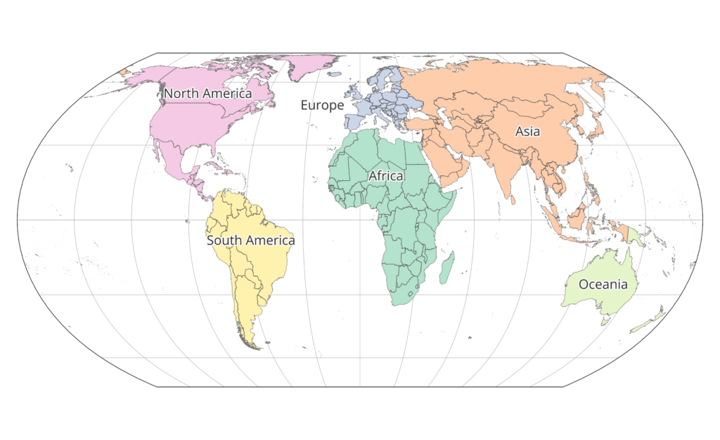
For many species, particularly those with cosmopolitan distributions, knowing the percent of population across the global, modeled population is not particularly useful for understanding the importance of a place for a species. This is especially true if a species has range across much of Russia or Africa, which we often do not model completely. To make these percent of population numbers more useful and relevant, we now provide “Percent of Modeled Continental Population” to regionalize these numbers and highlight the continental population importance.
Continents were defined starting on the ESRI World Continents layer and changing it so that all of Russia had been assigned to Asia, so that any given country was entirely contained within one continent. See the map below of continent associations.
What are EEZs?
Exclusive economic zones (EEZs) are maritime zones extending from a state’s coast or baseline over which a state has special rights over the exploration and use of marine resources. Generally a state’s EEZ extends 200 nautical miles out from its coast, except where resulting points would be closer to another country. We have sourced the spatial data on EEZs from marineregions.org. These can be useful for summarizing how much of the population or range of a species that has been modeled over the ocean falls within these exclusive zones for different countries. For species modeled over the ocean, it is important to pay particular attention to the amount of a species at-sea range is actually modeled, as that will impact the relevance and accuracy of the proportion of population, because we are providing estimates based on the modeled population, not the absolute, total population. Most at-sea species modeled ranges are incomplete. It is up to the user to decide whether this information is relevant and accurate.
How frequently will the web-based relative abundance maps be updated for Bald Eagle and Golden Eagle? We don’t want to state our assessments are based on the most recent data, and find they are not. Is there a scheduled cadence of updates?
Please see the Updated Release Schedule.
What is the spatial resolution of the relative abundance maps?
The highest spatial resolution for relative abundance maps is 3km X 3km. Aggregations of this resolution at 9km X 9km and 27km X 27km are available via the R package.
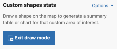
What are “Custom shapes stats”?
This functionality lets you draw custom shapes over areas of interest on the map to produce summaries of modeled percent of population for the selected species in that area. Similar to regional stats that describe the percent of modeled population for predetermined states/provinces, this feature allows you to create your own regions by drawing directly on the map. This feature is available for Abundance and Weekly maps – it is not available for Trends or Range maps.
Explore eBird Science Status and Trends
Visit https://science.ebird.org/en/status-and-trends and select a species to get started.
Zoom and pan
Use your mouse, keypad, or the navigation buttons in the top left of the map to zoom to a region. To pan around on the map, click and drag to the desired location. Automatically zoom to a species full range by clicking ‘Zoom to map extent’ in the upper left map controls.
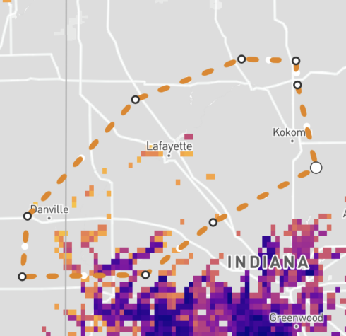
Draw a shape
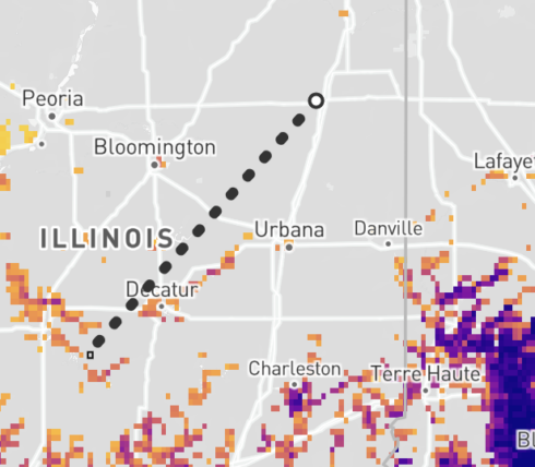
To get custom shape stats for a specific region, begin by drawing a shape on the map. Enable draw mode by clicking the square button in the top-left corner of the map or click the “Draw shape” button in the right-side panel. For most accurate results, zoom into a small area of interest and draw shapes over local areas.


When draw mode is active, a `drawing mode active` badge will appear at the top of the map, and the map cursor will be a crosshairs cursor:

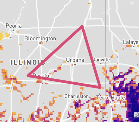
Shapes can be drawn by clicking each vertex point, or by clicking and dragging the mouse.
Click vertices method
Once draw mode is enabled, click on the map to set the first vertex. From here, a gray dotted line will appear alongside your cursor to indicate the first line of the shape. Click a second point on the map to set your next vertex. Repeat until you complete the shape. Double click to finish the shape.
Drag mouse method
Alternatively, once draw mode is enabled, click on the map where you want to start your shape. While clicking down, drag your mouse to draw a shape. Release the mouse to finish the shape.
Exit drawing mode
When drawing mode is active, the draw mode buttons are updated to allow you to exit drawing mode. Click one of these to manually exit draw mode. You will automatically exit draw mode any time a shape is completed.

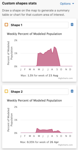
Shape Names
You are able to uniquely name each custom shape. The default name is Shape #. To name a shape, simply type in the ‘shape name’ input box in the leftmost column of the Abundance chart or the top left header of the Weekly area chart.
Get Percent of Population Summaries
Each shape you draw will return the percent of modeled population for that area and time period. When viewing Abundance maps, you will see a table for the percent of modeled population of each season. When viewing the Weekly map, you will see an area chart for the weekly percent of modeled population for the entire year. Changing between Abundance maps and Weekly maps will automatically update the table and chart summaries for the drawn shapes.
Abundance table
For migratory species, the percent of seasonal modeled population table will display columns for all possible seasons: nonbreeding, pre-breeding migration, breeding, and post-breeding migration. If a season is unavailable for the selected species, it will display ‘–’ for that season. For residents, a single year-round column will appear in the table.
Weekly Area Chart
The weekly percent of modeled population area chart shows the percent of modeled population for each week of the year over the entire year for a species. Mousing over the filled in chart area will display a tooltip with the associated week and its weekly percent of modeled population value. The week with the highest percent of modeled population for the year is highlighted below the chart as “Max: <x>% for week of <00 mm>”.
Additionally, a maximum percent of modeled population for ALL drawn areas is below the weekly area charts.
Charts are supported by Highcharts.
Percent of the modeled population
Percent of the modeled population is calculated by dividing the relative abundance at each pixel by the sum of the relative abundance across all pixels for a given time period (week or season). This allows values to be summed within shapes and for safe comparison across weeks and species. The map data is aggregated at different zoom levels, so the larger the map scale/the more zoomed in you are, the more accurate your results will be.
Edit a polygon
To modify the shape of your polygon, click the shape on the map to make it active – active polygons will have dashed lines with white dots at each vertex. Click on a node (white dot) and drag to create the desired shape. To move an entire shape, click the shape to make it active, then hold down your mouse to drag it to the desired location. The custom shape stats will update automatically. If a portion of the edited shape is off-screen, an error message will appear in the summary table or chart. The error message will include an option to zoom to the shapes to update their summaries. Note that all shape summaries may be updated, and the numbers might deviate slightly due to different aggregation levels.
Delete a polygon
To delete a polygon on the map, click on the polygon to select it (when selected the solid line becomes a dashed line) and then click on the garbage icon in the upper left of the screen, to the right of the shape name form in the custom shapes stats table or chart.


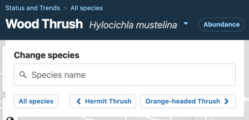
Change the species
In the top-left corner of the map, you can update the map and summary statistics with different species. Each species change will update the map and summary statistics charts for any shape on the map. Shapes must be fully visible on the map to update their summary statistics. If any portion of any shape is off-screen, an error message will appear in the summary table or chart. The error message will include an option to zoom to the shapes to update their summaries. Note that all shape summaries may be updated, and the numbers might deviate slightly due to different aggregation levels.
Export the data
You can export summary statistics results for a single species as a CSV by clicking the `Export data` button in the bottom right of the sidebar. Note that you need to be logged in and have received an Access Key (which happens instantly upon submitting the form).

This will download two files:
- A CSV with percent of modeled population data for all available weeks and seasons for each drawn shape (default title: ebirdst_<species-code>_data.csv)
- A CSV with each drawn shape formatted as a Well-known text (WKT) polygon (default title: ebirdst_<species-code>_wkt_polygons.csv)
The data CSV contains 5 columns:
- species_code: shorthand eBird species code
- species_name: common name for the selected species
- shape_id: name of each drawn shape – if a shape name was not manually defined, the default Shape # will be used
- time_period: the week or season of interest
- perc_pop: the percent of modeled population for the time period for the given shape
For each custom shape, there will be either 56 rows of data for migrants or 53 rows of data for residents: 52 weeks of the year, plus 4 migratory seasons or 1 year round summary.
The WKT CSV contains two columns:
- shape_id: the name associated with each custom shape (this name matches the shape_id in the data CSV so that users can join the data)
- wkt_polygon: Well-known text polygon of the drawn shape
Well-known text can be uploaded into various softwares (including desktop GIS software) and joined with the percent of modeled population data for spatial analyses.
Basemap legend
The shaded portion of the map indicates the “modeled area,” where there was sufficient data to run a model, but the species was predicted to be absent. Sufficient data required there to be, on average, at least 0.5% spatial coverage of 3 kilometer grid cells within the region for a given week. The unshaded portion of the map refers to areas of “no predictions” where there was insufficient data to assess whether the species was present or absent. That is, there was less than 0.5% spatial coverage of 3 kilometer grid cells within the region for a given week.

Options and Settings
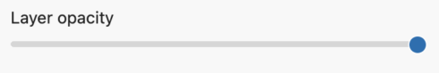
- Change the opacity of the map layers with the layer opacity slider below the legend in the sidebar.
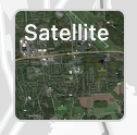
- Change the basemap with the basemap toggle in the upper right corner of the map (bottom left in mobile). Basemap options are satellite and light mode.
- When viewing weekly charts for drawn shapes, adjust the charts’ x-axis in the Options dropdown menu.
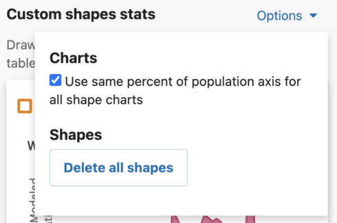
- The Use same percent of population axis for all shape charts checkbox will use the maximum percent of modeled population value from all drawn shapes in the x-axes.
- Turning this option off will update the charts to show the maximum value for that individual shape.
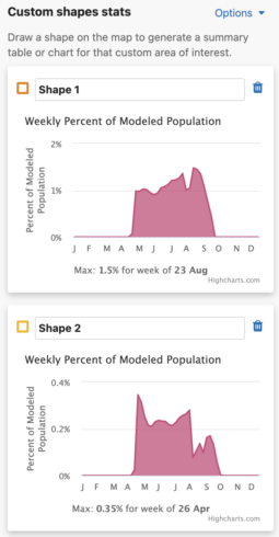
- The Use same percent of population axis for all shape charts checkbox will use the maximum percent of modeled population value from all drawn shapes in the x-axes.
- Delete all shapes by opening the custom shapes stats options menu and clicking the Delete all shapes button.
Range
How are species’ ranges defined?
A Species’ range is defined as the area where the species has been estimated to be present by more than half of the models in the ensemble making predictions at a given location for a given week.
Each species’ range was estimated for all 52 weeks of the year at 3 km × 3 km grid cell locations. To create easy-to-read range boundaries, the 3 km grid data were aggregated to a 9 km grid and spatially smoothed. Both the smoothed, aggregated seasonal boundaries and the raw 3 km grid cell boundaries are available for download.
See featured examples of eBird Status and Trends range maps
How is “Percent of region occupied” calculated?
Percent of the region occupied is the percent of the selected region that is covered by the range of the species.
How is “Percent of seasonal range in region” calculated?
Percentage of modeled range in a region is calculated as the fraction of a species’ modeled range that falls within the selected region. This will be a reasonable estimate if the whole population is within the “modeled area.”
See featured example of regional stats
How is “Days of occupation in region” calculated?
Days of occupation in a region is the number of days that a species is present in the selected region. A species is defined to be present in a region when at least 5% of the region was within the species range during the given season.
Trends
How are Trends defined?
The eBird Trends maps show the cumulative percent change (or trend) in relative abundance across a grid of 27 x 27 km pixels for a study period of 7-15 years, depending on the global region, represented by blue (increasing) and red (decreasing) pixels. The darker the color, the stronger the trend for each pixel. White circles are areas where the estimated direction of the trend is uncertain (read more uncertainty estimation here). To emphasize where overall population change was greatest on the trend maps, each 27 x 27 pixel is also sized by the estimated relative abundance at the midpoint of the regional study period.
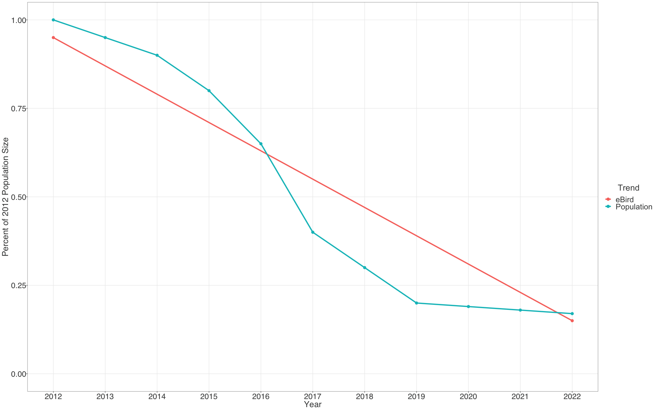
Each pixel shows the cumulative percent change in population size between the start and end years of the study period. Thus the trends estimated here average across the annual fluctuations in the underlying population trajectory. This is illustrated below where the blue dashed trajectory shows the annual fluctuations in population size across the 2012-2022 study period. The solid red line shows cumulative change in the population over the study period as a straight line, with a slope equal to the mean percent per year rate of population change. The eBird trends estimate the mean percent per year rate of population change over the study period, the slope of the red line.
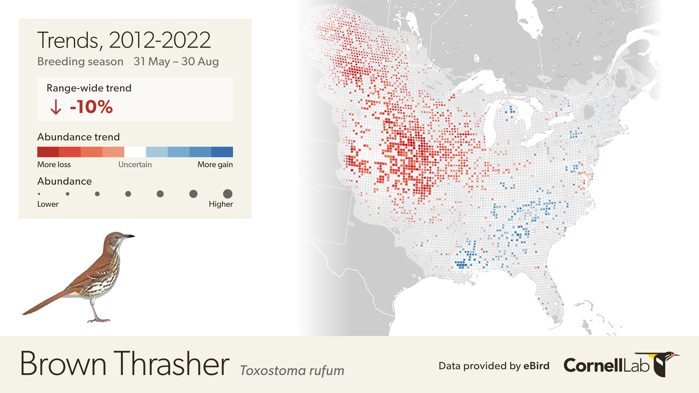
The example below highlights how to interpret the Trends maps.
The range-wide view of the Brown Thrasher Trends map shows clear regional differences—the species is increasing in some areas and decreasing in others. In parts of Tennessee, North Carolina, and Georgia, Brown Thrashers are increasing, but also note that the circles get smaller north of Athens, Georgia and east of Knoxville, Tennessee indicating lower abundances in the higher elevation portions of the Great Smoky Mountains.
In Oklahoma and Nebraska, Brown Thrasher abundance is decreasing. Again, note that the circles are smaller between Wichita and Dallas indicating lower abundance of Brown Thrasher, especially approaching the edge of the species range near Dallas, Texas.
White pixels on the map indicate uncertainty in the direction of the trend. To see the direction of the uncertain modeled estimates toggle the bar under the trend abundance legend.
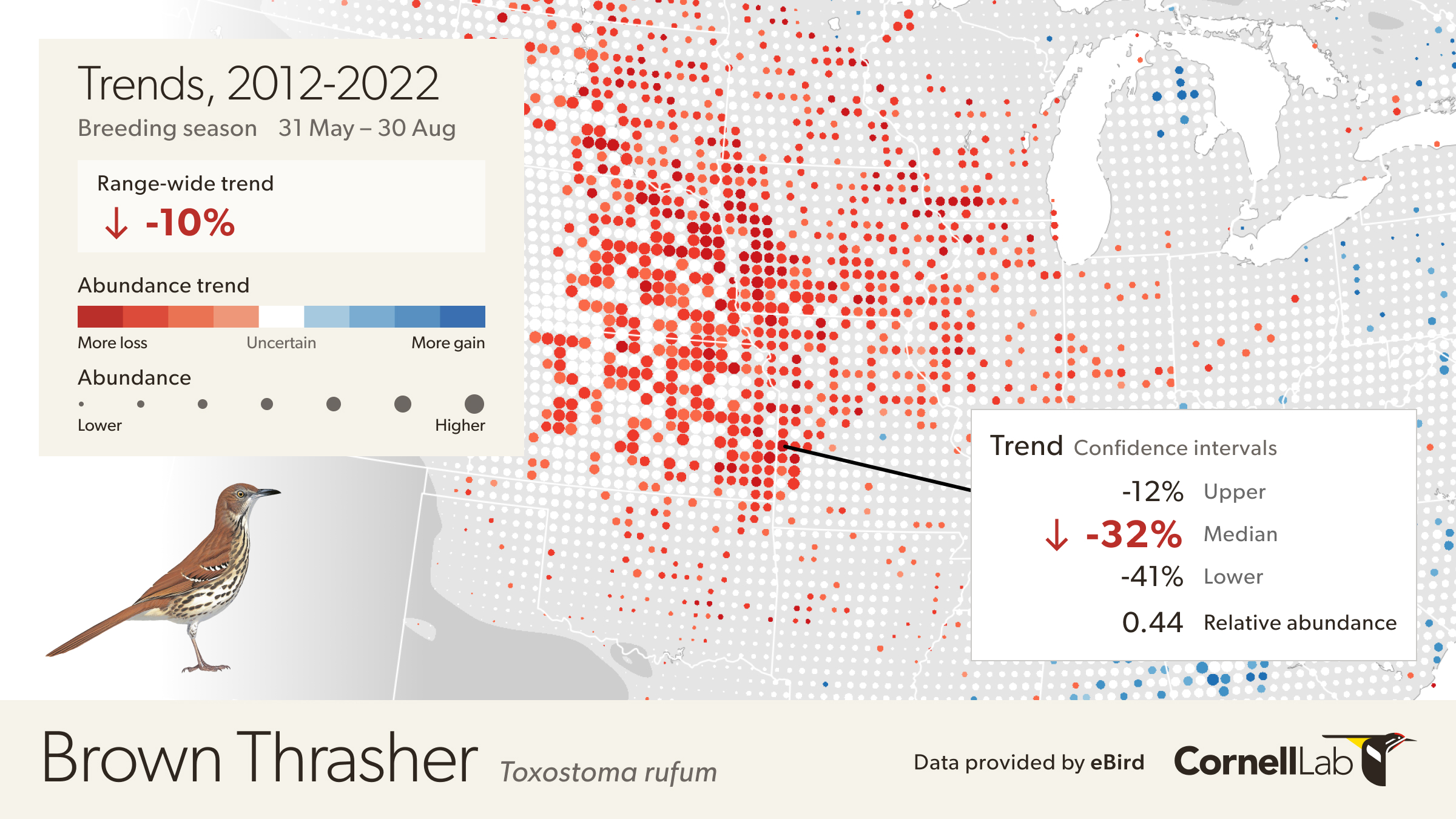
Move the mouse over the map to get detailed information including relative abundance trends and confidence intervals. In this example, the pixel is showing a 32% decline over the period of 2012-2022. Mouse over pop-ups also include the 80% confidence interval, or range of values where the model is fairly confident the true trend could be, with it being most likely near the median value. In this example, the confidence interval ranges from -12% to -41%, indicating a higher confidence that the true trend at this location is decreasing. The pop-up also provides the value for relative abundance at that location in 2017, making it easier to compare abundances numerically between locations.
How are Trends estimated?
Each eBird participant determines where, when, and how they go birding. And over time eBirders tend to change how they bird, often becoming more efficient at detecting and identifying species. These changes make it difficult to estimate population trends because changes in bird populations can be confounded with changes in how participants’ search for and record birds, the participant observation process. These confounding factors present a fundamental analytical challenge for estimating trends from eBird data.
To address this challenge, we use a novel modeling approach designed to estimate species population trends while controlling for interannual confounding factors. The approach is based on double machine learning, a statistical framework that uses machine learning to estimate how participants change their search patterns over the years, and then use this information to isolate changes in species’ population from change in the observation process itself. To learn more about this analytical methodology, see the publication “A Double machine learning trend model for citizen science data” in Methods in Ecology and Evolution. .
An important part of generating estimates of population trends is to assess the robustness and reliability of the resulting estimates. We do this in two ways. First, we assess the robustness of the analytical approach for each species by testing it with numerous different types of population change (differences in the direction, strength, and spatial patterns of population change). Good performance across these tests gives us confidence that the method can adapt to a wide variety of realistic types of population change. Second, we estimate the uncertainty of each trend map to assess the reliability of the estimates. Understanding the level of uncertainty is a critical component for interpreting the trend estimates because it provides a guide for separating the signal from the noise, helping to identify where we can be most certain about the estimated change in species populations. Learn more about this analytical methodology in the publication.
What are the Trend uncertainty estimates?
To quantify the uncertainty associated with trend estimates a data resampling approach was used to capture sampling variation across an ensemble of 100 estimates. The lower 10th and upper 90th percentiles were recorded across the ensemble to compute 80% confidence intervals for each 27 km x 27 km pixel trend estimate.
If a confidence interval contains zero, then there is low confidence in the estimated direction of the trend (positive or negative). By default, circles with low confidence in the estimated direction are shown in white on the trend maps. To see the trends across all locations toggle the “Show All Trends” in the legend. Note, for some applications, e.g. when studying spatial patterns of population change, it can be advantageous to consider trend estimates at all locations and account for uncertainty in other ways.
Why does the size of the circles vary on the Trends maps?
On the eBird Trends maps, 27 km x 27 km regions or pixels are represented by circles. To emphasize the important, high abundance portions of species ranges, these circles have been sized according to relative abundance (see here for more about abundance) at the midpoint of a given trends study period (start dates range from 2012 to 2016 depending on global region).
Why are trends available for only one season?
For each species, we’ve chosen the season that was most likely to give us reliable trends estimates for as much of the population as possible. For trends analysis, a significant amount of data is required and the estimates are more reliable when the species is more easily detected. While many species are more detectable when vocalizing during their breeding season, many species breed far from our highest data density areas and would produce poorer quality estimates. In those cases, we’ve chosen to generate estimates for the non-breeding season. While it would be possible for many species to generate reliable trends at both breeding and non-breeding seasons, it is computationally expensive.
Why are trends not available for all species?
Our goal is to showcase trends for as much of the North American avifauna as our analysis will reliably allow while showing examples from other parts of the world where the volume and longevity of eBird data can be supported by the analysis. We intend to increase the number of species we update trends estimates annually. This link provides a list of all species with trends available.
Why are trends limited to a portion of a species range?
Our goal is to produce trends for regions where the volume and longevity of eBird data can support the trends analysis. See the FAQ item about Trend study period for a list of the regions and start years we have used. In many of these regions, such as India and South Africa, adjacent countries and the resulting portions of species’ ranges nearby lack sufficient data for the trends analysis and would perform poorly, degrading the overall trend estimates. Accordingly, we have masked species ranges to the above regions, as these are the regions most likely to currently produce robust estimates of trends. The light gray background polygon shows the full range of the species, including areas where we did not produce trend estimates. See the section on modeled seasonal ranges to learn more.
What are the “modeled seasonal ranges” for eBird Trends?
On Trends maps, the areas inside a species modeled range have a light gray background, while those areas outside of a species modeled range have a dark gray background. The notion of a “modeled range” refers to the range boundary defined in our Range products. Sometimes, the modeled range is incomplete compared to reality and these incomplete areas will be represented with a dark gray background. Within the species modeled range, we have produced trend estimates within particular regions (see list here). For some species, such as the American Kestrel in South America, there is a pale gray background, but no circles representing trends estimates. This happens when our Range products have indicated the species is present, but we have not attempted to estimate trends within that region.
Why do some species have a different start year for eBird Trends?
Our goal is to produce trends for regions where the volume and longevity of eBird data can support the trends analysis. This is done by looking at the data density of individual species at a range of start years and choosing the start year that can support as many species as possible. The regions and start years we have used in the 2022 version are included in the table below.
| Region | Includes | Start Year |
| North America | Mexico, Central America, and Caribbean, but not Nunavut and the Northwest Territories | 2012 |
| Taiwan | Not Kinmen | 2012 |
| Iberia | Spain and Portugal | 2014 |
| Australasia | Australia and New Zealand | 2014 |
| India and Southeast Asia | India, Nepal, Bhutan, Sri Lanka, Thailand, Cambodia, Malaysia, Brunei, Singapore, and the Philippines | 2015 |
| South America | Colombia, Ecuador, Peru, Chile, Argentina, and Uruguay | 2015 |
| Japan | Japan | 2016 |
| South Africa | Including Lesotho and Eswatini | 2016 |
| Turkey and surrounding | Turkey, Cyprus, Israel, Palestine, Greece, Armenia, and Georgia | 2016 |
Where can I learn more about how to analyze and use Trends data products?
The methodology used for Trends data products can be reviewed in the paper published in Methods in Ecology and Evolution. Additional information about how to analyze Trends data in R can be found on our github page and in a webinar detailing how to work with eBird Status and Trends data products.
Download Trends data products or download individual species
What Trends data are available for download?
Trends data products are available in two ways, from two sources. First, on a species’ page on the website, under the Download button in the top right, you will find geospatial data (as a GeoPackage) that contains the circles as depicted on the maps we produce, with the individual values available for each circle. For most GIS users, this will be the fastest and most ideal format, as it can also be converted to points easily. Second, the results for all species are available via the R package. To learn more about accessing this data, please visit the vignette. Both products require agreeing to our Terms of Use and filling out the data access form (which has automatic access for non-commercial use).
How are Trends regional summaries calculated?
The regional (state/province) trends combine the estimates at all 27 km pixels within the region to generate one abundance weighted mean trend estimate. The calculation of the confidence intervals at a regional level is more complicated, which is why we have not included Custom shape stats for Trends. All regional trends, including a rangewide trend, are available for download as a table under the Downloads link on each species page.
Why do trends I’ve accessed via the Science paper look different from those on the eBird Status & Trends website?
The trends published in the Science paper “North American bird declines are greatest where species are most abundant” were for a study period of 2007 through 2021. The latest version released on the eBird Status and Trends website were for the study period of 2012 through 2022 (for North American species). Additionally, the latest version used a different method to adjust for residual confounding, by applying the adjustment at the pixel scale instead of range-wide.
Technical
What modeling methods were used?
The bird observation data are the backbone of eBird Status and Trends Data Products and visualizations. The total dataset consists of 63.7 million eBird checklists (sample size) from 32 million unique locations collected from 2009 through 2023 across the world.
To generate estimates of relative abundance the eBird Science team created statistical and machine learning models (Fink et al. 2019). The models include three classes of predictor variables that account for variation in environmental and participatory science data. The predictors include: (1) six search-effort variables, 12 hourly weather variables and two variables about the moon to account for variation that affects how well a birder can detect a species in a region if it is present, (2) three variables to account for variation during different periods of time (within day, day, and year), and (3) 128 environmental descriptors from remote sensing data to capture associations of birds with a variety of landscapes.
The search-effort variables are: (1) the time spent searching for birds, (2) whether the observer was stationary or traveling, (3) the distance traveled during the search, (4) the number of people in the search party, (5) traveling rate (kilometers per hour), and (6) a standardized measurement to account for differences in behavior among eBirders (the Checklist Calibration Index (CCI) described in Kelling et al. 2015 and Johnston et al. 2018). The 12 hourly weather variables come from the Copernicus ECMWF hourly reanalysis product (Hersbach et al. 2018) and along with the two moon variables (fraction illuminated and altitude above or below the horizon) help account for both an observer’s ability to detect species and activity levels of a species that affect its availability to be detected.The observation time of the day, represented as the difference in hours from solar noon at the location of the checklist, is used to account for variation in bird behavior throughout the day. The day of the year (1-366) and year on which the search was conducted are used to capture intra- and inter-annual variation. To describe the local landscape where eBirders went birding, variables describing elevation and bathymetry (NASA et al. 2019, GEBCO Compliation Group 2024); topography (Amatulli et al. 2017); shorelines (Sayre et al. 2021); islands (Sayre et al. 2018); mountains (Snethlage et al. 2022); land cover, land use & hydrology (Friedl & Sulla-Menashe 2019); seasonal surface water (Pekel at al. 2016, NASA et al. 2019); roads (Meijer et al. 2018); nighttime lights (Cao et al. 2014); semi-monthly enhanced vegetation index (Didan, K. 2021); monthly ocean chlorophyll, sea surface temperature, and sea surface temperature anomaly (NASA 2019, 2022) are included in the model. From these variables we generate a suite of predictors that describe the average feature value and how much it varies across the local landscape, defined here as a 3 km pixel.
The statistical model aims to generate accurate predictions of each species’ occurrence and abundance while dealing with the inherent challenges of abundance estimation based on participatory science data (Fink et al. 2019). We use three models: a binary classification model to estimate presence/absence, an occurrence rate model to estimate occurrence probability (or encounter rate), and a count model to estimate counts. All of these models are based on Random Forests (RFs) (sensu Johnston et. al. 2015) and incorporate the list of predictor variables (above). To alleviate site selection biases, common in participatory science data sets, we create a spatially- and temporally-stratified random subsample of the training data to help balance spatial and temporal coverage. By including search-effort and weather predictors in the RF models, we can control for important sources of variation in detectability when making predictions. We also case-balance two of the models, including the occurrence model (Chen et al. 2004, Robinson et al. 2018), to improve performance for rare and/or hard to detect species and we calibrate occurrence rate predictions to ensure the probabilistic quality of the resulting estimates (Dormann 2020).
To scale-up the relative abundance base model across global-year-round spatiotemporal extents while preserving fine-scale information we use a divide-and-recombine strategy based on the Adaptive Spatio-Temporal Exploratory Model (AdaSTEM; Fink et al. 2013, Fink et al. 2014). The AdaSTEM framework creates and trains an ensemble of spatiotemporally overlapping base models that are subsequently recombined based on shared locations and dates. The ensemble is constructed by partitioning the study extent using a randomly located and oriented spatiotemporal grid. Each partition cell is a spatiotemporal block called a stixel. Each stixel defines the spatiotemporal extent for a single base model that is independently trained using data that falls within that stixel. The stixels’ temporal width is set to 28 days and the spatial stixel dimensions were adaptively sized to generate smaller stixels in regions with higher data density, using QuadTrees (Samet 1984), a recursive partitioning algorithm. To generate independent, overlapping base models, the randomized partitioning process is repeated 100 times and in each partition training data is subsampled. Finally, to make ensemble predictions at a given location and date, the 100 overlapping base model predictions are averaged.
The AdaSTEM-based Status workflow generates five data products: estimates of species’ 1) occurrence rates, 2) abundances, 3) ranges, 4) model validation metrics, 5) habitat importance.
Which eBird data were used to generate the Status and Trends Data Products and visualizations?
Checklists used in Status and Trends Data Products must meet the following conditions to be included in analyses.
- Submitted as of 10 February 2024
- Observation dates from 1 January 2009 through 31 December 2023
- Complete checklists (all bird species detected and identified were included)
- The primary checklist in a shared checklist
- Checklists that used the generic traveling or stationary protocols (i.e., not incidental protocol)
- If traveling checklists, were not longer than 10 kilometers (up to 30 km for species modeled only over ocean)
- Not longer in duration than 24 hours
- Contained information on: start time, duration, protocol, number of observers, and distance traveled.
- Counts of species were available (i.e., a species was not just noted as ‘present’)
See the eBird Help Center for more information about eBird checklists.
What environmental data were used for the Status and Trend Data Products and visualizations?
The analyses used to produce the eBird Status and Trend products rely on matching bird observations with characteristics of the local environment. We used data on elevation, topography, and habitat to describe the local landscapes where eBirders searched for birds. Each checklist location is matched to the environmental data within a 1.5 km radius around the location. For elevation, bathymetry, and bathymetric slope, we calculated the mean and standard deviation of each within the checklist radius using the the ASTER Global Digital Elevation Model at 30m resolution (NASA et al. 2019) for high resolution terrestrial elevation and the GEBCO ice surface elevation (GEBCO Compilation Group 2024) at 250m resolution for a coarser resolution terrestrial elevation and all bathymetry and bathymetric slope. For topography the aspect and slope within the checklist radius were calculated as the mean and the standard deviation (Amatulli et al. 2018). Habitat was described using the MCD12Q1 dataset from NASA and the FAO-Land Cover Classification System, which includes classes for land cover, land use, and hydrology by year. Water cover was described with two datasets: a) the Aster Global Water Bodies Dataset, covering 2000-2013 at 30 meter spatial resolution, and with ocean, river, and freshwater categories (NASA/METI/AIST/Japan Spacesystems 2019), and b) yearly seasonal surface water, at 30m resolution (Pekel et al. 2016). Islands and continents are identified using the global shoreline dataset (Sayre et al. 2019). Unique mountain ranges were described with the Global Mountain Biodiversity Assessment (GBMA) of mountain ranges (Snethlage et al. 2022). Descriptions of shorelines came from a global classification of coastal segments (Sayre et al. 2021). These were categorical descriptions of erodibility and marine physical environment and continuous descriptions of seven biogeophysical characteristics. The land cover and water cover datasets were summarized as the percentage of land cover and edge density within the 1.5 km radius of each checklist. Categorical shoreline features were summarized as class density and diversity, while continuous features were summarized as a mean and standard deviation, both within the 1.5 km radius of each checklist. We used the EOG Annual VNL v2 product for nighttime lights, year matching for 2014-2023. The nighttime lights values were calculated as the mean and standard deviation within the checklist radius. We summarized road density for five types using the GLOBIO Global Roads Inventory Project (GRIP) (Meijer et al. 2018). Hourly weather variables are assigned at 30 km spatial resolution based on the Copernicus ERA5 reanalysis product (Hersbach et al. 2021). Similarly, moon fraction illuminated and altitude above or below the horizon at the date and location of checklists are assigned using the suncalc R package. Because of the coarse resolution of both weather and moon and the potential to maximize to unrealistic combinations of conditions, these were not used as spatial predictors in the estimates for a given 3 km grid cell, instead we predicted to a multivariate-optimized set of weather and moon conditions that maximized the relative abundance estimate to the 90th percentile within the region and a one-month window.
How are seasons defined for each species? Why are there gaps between seasons?
Breeding and non-breeding season dates are defined for each species as the weeks when the species’ population does not move. For this reason, these seasons are also described as stationary periods. The dates were defined by experts in the status and distribution of birds based on the weekly abundance maps. The selected dates were then checked to make sure that they generally matched expected patterns of phenology for the species.
Migration periods are defined as the periods of movement between the stationary non-breeding and breeding seasons. Note that for many species these migratory periods include not only movement from breeding grounds to non-breeding grounds, but also post-breeding dispersal, molt migration, and other movements. For some species, the transition between stationary and migratory seasons is not clear. Both breeding and non-breeding ranges are often represented within the migratory seasons since some individuals will have arrived in those areas while other individuals of the species are still migrating. In these cases transitional weeks were excluded to provide the clearest picture of individual seasons. For some species, this resulted in seasons that appear shorter than expected, especially when considered within specific regions.
Season dates are defined specifically to be used with eBird Status and Trends Data Products. These dates should not in general be used to delineate the migration and breeding phenology of species, although in many cases Status and Trends dates may approximate these phenological dates. In addition, the dates used for Status and Trends are distinct from the corresponding seasonal dates defined in Birds of the World.
Why are pre-breeding and post-breeding migrations sometimes separated?
Some species have pre-breeding and post-breeding migration seasons combined into a single migratory season. These species (e.g., Magnolia Warbler, Black-throated Gray Warbler) use fairly similar areas for both their migrations. However, some species such as Rufous Hummingbird use different paths for their two migrations. For these species we split the map to show pre-breeding migration (green) and post-breeding migration (yellow) separately. If at least 40% of the area used for one migration season is not covered by the other migration season, then we show them as distinct colors.
What is the difference between “modeled area” and “no prediction”?
On the relative abundance and range maps the light gray shows the “modeled area,” where there was sufficient data to run a model, but the species was predicted to be absent. Sufficient data required there to be, on average, at least 1% spatial coverage of 3 km grid cells within the region for a given week. The dark gray refers to areas of “no predictions” where there was insufficient data to assess whether the species was present or absent. That is, there was less than 1% spatial coverage of 3 km grid cells within the region for a given week.
Why are some islands areas of “No Prediction”?
Some islands have insufficient data to predict whether a species is present or absent (see above in What is the difference between “modeled area” and “no prediction”?). In eBird Status and Trends, we use an island dataset (Sayre et al. 2019) that enables us to distinguish between islands with and without a particular species. The benefit of this method is that the models can, in effect, distinguish the geographic barriers relevant to islands, constraining species to or excluding species from specific islands. The distributions in the Caribbean for both White-winged Dove and Mourning Dove are good examples of this method in action. However, a consequence is that for species that show variation between islands, each island now needs more information before we can make predictions. As a result, many islands that are not frequently eBirded, such as a number of the islands in coastal British Columbia, are often represented as “No Prediction.”
Some of the maps have errors? Why does this happen?
Like any predictive models, the eBird Status and Trends models make errors when predicting species ranges and abundance. When predicting ranges there are two types of errors: predicting species absence in areas that are actually occupied and predicting species presence in areas that are actually unoccupied. There can also be errors in the estimates of relative abundance, with estimates that are higher or lower than the actual counts.
The predictive models used to generate the Status and Trends Data Products account for gaps in eBird data by sharing information from nearby areas. This works well when (1) there is sufficient eBird data to capture patterns of species’ occurrence and abundance and (2) when the environmental data together with the other predictors used in the models do a reasonably good job describing the ecological characteristics that are important to the species.
Error rates generally increase in regions when one or both of the above conditions is not met. First, in regions where the density of checklists is low (e.g. north central Canada and the Amazon basin) there is little information to learn patterns of species’ occurrence and abundance. In these areas, incorrect extrapolation can be a risk. For example, species that occur on the coast of Greenland, such as Iceland Gull, are often extrapolated inland, where they likely do not occur, but where there is no data to inform their absence.
Second, error rates also tend to be higher when species’ detection rates are low. Even if there are many checklists in a region, having very few detections of a species limits the amount of information available to characterize the environment that the species is associated with. Third, error rates increase in regions and for species for which the environmental data fail to describe important ecological features for each species.
Why do some products show as “Unavailable” or cannot be clicked on?
Missing products for a species indicate that the model was poor and expert review indicated that the product and/or season should be excluded from the available visualizations and analysis. See section Some of the maps have errors? Why does this happen? For more information about prediction errors.
Can I download the data?
Both eBird Status and Trends Data Products are available via our Data Access Request form and can be downloaded either directly through the website or by using the ebirdst R package, which can be used to access, manipulate, and analyze these data.
If you are looking to use the data primarily in GIS software, you can directly access GeoTIFF files via the Download link at the top right of each species’ page. The download page then lists all downloads available for the species.
Spatial data for range boundaries can be downloaded as Geopackage (GPKG) files. The boundaries are available both as raw (directly from the analysis) and smoothed (as seen in the visualizations) range boundaries. See the Range section below to learn more.
All images of the maps available on the eBird Status and Trends website can be downloaded and used for presentations and display. Please see our Terms of Use for specific species limits that vary among use cases.
The complete set of regional abundance and range statistics are available as a CSV file for download.
All downloads are available through or on the Download page. All downloadable visualizations can be used for research and presentations provided they are for non-commercial purposes and properly attributed; see our Recommended citations below.
Recommended citation: Fink, D., T. Auer, A. Johnston, M. Strimas-Mackey, S. Ligocki, O. Robinson, W. Hochachka, L. Jaromczyk, C. Crowley, K. Dunham, A. Stillman, C. Davis, M. Stokowski, P. Sharma, V. Pantoja, D. Burgin, P. Crowe, M. Bell, S. Ray, I. Davies, V. Ruiz-Gutierrez, C. Wood, A. Rodewald. 2024. eBird Status and Trends, Data Version: 2023; Released: 2025. Cornell Lab of Ornithology, Ithaca, New York. https://doi.org/10.2173/WZTW8903
How do we ensure that the eBird data are accurate?
There are more than 5,000 automated filters that are active during the submission process for every checklist submitted in eBird. The common filters that may be triggered are for species that are rare for a region and/or season and abnormally high counts of a species for a region and/or season. eBird will ask that additional information (description of the bird(s), counting process, pictures, sound recordings, etc.) be provided for these observations. There are also more than 2,000 eBird reviewers worldwide who examine these checklists as they are submitted. These reviewers work to make sure that each rare sighting is validated before the data from each checklist is available to be used in any analyses.
What happened to the eBird Status and Trends Data Products from previous years?
Previous versions of the Data Products have been permanently archived at the Cornell Lab of Ornithology. If you have accessed and used previous versions and/or may need access to previous versions for reasons related strictly to reproducibility in publications, please contact ebird@cornell.edu and your request will be considered.
Read this if you are thinking of comparing estimates across years: Every year, there are a number of important changes made to the estimates. These changes were made to improve the quality and scope of the Data Products, taking advantage of increased data volume and quality as well as methodological improvements. These changes were not designed to facilitate cross-year comparisons. For this reason, we do not suggest comparing differences between different versions of a data product, and any differences that are found may be entirely caused by differences in our analytical methods and have no biological meaning.
How do the maps match what we know about each species’ biology?
Each species map is reviewed, week-by-week, by species distribution experts. Individual seasonal products exhibiting serious inaccuracies are rejected. Species distribution experts evaluate the information over the entire range and if most of it is accurate, the species and season combo is retained. Small regions of false positives or false negatives are acceptable (and highlight areas where more data is needed). Any season (for a single season or all seasons for a single species) that is rejected by an expert reviewer is excluded from all Status and Trends Data Products, including the visualizations online and the downloadable data.
Why does an eBird Status and Trends taxonomic concept not match with elsewhere on the eBird website?
eBird Status and Trends products are generated regularly but due to limitations in the availability of remotely-sensed satellite data the products take months to generate. As a result, the taxonomy used for eBird Status and Trends Products is at least one year or version behind the current eBird Taxonomy. As a result, there are discrepancies in taxonomy. The two most common cases are: a) splits and lumps where the new taxonomic entry retains the same name it previously had, but the eBird Status and Trends now represents either multiple species that have been split off or multiple subspecies lumped, including ones that were not included in the modeling process for that species, and b) slashes where eBird Status and Trends modeled two taxonomic entries as one previous, species.
Going from Taxonomy v2024 to v2025:
- Willow Ptarmigan was modeled with data from both Red Grouse and Willow Ptarmigan.
- Mexican/Common Squirrel0Cuckoo was modeled with data from both species.
- Hudsonian/Eurasian Whimbrel was modeled with data from both species.
- Imperial Cormorant was modeled with only data fom subspecies atriceps and albiventer.
- Tawny Owl was modeled without data from Maghreb Owl, which has now been lumped.
- Collared/Pale-mandibled Aracari was modeled with data from both species.
- Monk/Cliff Parakeet was modeled with data from both species.
- Red-lored/Lilacine Amazon was modeled with data from both species.
- Collared/Marañon Antshrike was modeled with data from both species,
- Nutting’s/Salvadoran Flycatcher was modeld with data from both species.
- Eastern/Western Warbling Vireo was modeled with data from both species.
- White-throated Thrush was modeled with data from both White-throated Thrush and Dagua Thrush.
- Western Red-legged Thrush was modeled with data from Western Red-legged Thrush and Eastern Red-legged Thrush.
- Northern/Mangrove Yellow Warbler was modeled with data from both species.
Going from Taxonomy v2023 to v2024:
- Blue-throated Flycatcher was modeled with the subspecies dialilaemus, which has now been moved to Hainan Blue Flycatcher.
- Pacific Swallow was modeled with data from both Pacific Swallow and Tahiti Swallow.
- Cory’s/Scopoli’s Shearwater was modeled with data from both species.
- Northern/Southern Nutcracker was modeled with data from both species.
- Red-flanked/Qilian Bluetail was modeled with data from both species.
- European/Gray-crowned Goldfinch was modeled with data from both species.
- Northern/Southern House Wren was modeled with data from both species.
- Brown/Cocos Booby was modeled with data from both species.
Why are there different versions of eBird Status data products on the website?
As of April 30 2025, we have generated new estimates for 2,974 species. Approximately 381 species that were previously run for the 2021 version are still accessible at their species-specific URLs, but are not searchable on the website or currently available in the R package. If you are considering using species across versions, please note that the only appropriate data product for doing so is the percent of population layer available in the R package. Do not attempt to do cross-year analysis with multiple versions of the same species, there are many differences in the methodologies of the estimates.
How are ocean species modeled?
For the first time, we have modeled species over both ocean and land, in an attempt to more accurately describe species that have significant at-sea periods of their annual cycles and to provide data for these species where data can support results to help improve taxonomic completeness in coastal areas. While quality is generally lower than for terrestrial species, especially further away from land, these provide a good indicator of what will be possible in the future with pelagic species. Modeling species in this way has been made possible by: a) including a suite of ocean-specific covariates (bathymetry, bathymetric slope, monthly mean ocean chlorophyll, monthly mean sea surface temperature, and monthly mean sea surface temperature anomaly, b), making a number of workflow changes to accomodate checklists and predictions over both land and ocean (see Changelog), and c) including checklists up to 30km in length (limited to 10km over land) for checklists that are more than 50% ocean, to increase sample size.
References
Amatulli, G., S. Domisch, M.-N. Tuanmu, B. Parmentier, A. Ranipeta, J. Malczyk, and W. Jetz (2018). A suite of global, cross-scale topographic variables for environmental and biodiversity modeling. Scientific Data 5:180040.
Cao, C., F. J. De Luccia, X. Xiong, R. Wolfe, and F. Weng (2014). Early On-Orbit Performance of the Visible Infrared Imaging Radiometer Suite Onboard the Suomi National Polar-Orbiting Partnership (S-NPP) Satellite | IEEE Journals & Magazine | IEEE Xplore. IEEE Transactions on Geoscience and Remote Sensing 52.
Chen, C. (2004). Using Random Forest to Learn Imbalanced Data. University of California Berkeley 666.
Didan, K. (2021). MODIS/Terra Vegetation Indices 16-Day L3 Global 250m SIN Grid V061 [Data set]. NASA EOSDIS Land Processes Distributed Active Archive Center. Accessed 2023-11-09 from https://doi.org/10.5067/MODIS/MOD13Q1.061
Dormann CF. Calibration of probability predictions from machine-learning and statistical models. Global Ecol Biogeogr. 2020; 29: 760–765. https://doi.org/10.1111/geb.13070
Fink, D., T. Auer, A. Johnston, V. Ruiz-Gutierrez, W. M. Hochachka, and S. Kelling (2020). Modeling avian full annual cycle distribution and population trends with citizen science data. Ecological Applications 30:e02056.
Fink, D., T. Damoulas, N. Bruns, F. La Sorte, W. Hochachka, C. Gomes, and S. Kelling (2014). Crowdsourcing Meets Ecology: Hemisphere-Wide Spatiotemporal Species Distribution Models. AI Magazine 35:19–30.
Fink, D., T. Damoulas, and J. Dave (2013). Adaptive Spatio-Temporal Exploratory Models: Hemisphere-wide species distributions from massively crowdsourced eBird data. Proceedings of the AAAI Conference on Artificial Intelligence 27:1284–1290.
Fink, D., Johnston, A., Strimas-Mackey, M., Auer, T., Hochachka, W. M., Ligocki, S., Oldham Jaromczyk, L., Robinson, O., Wood, C., Kelling, S., & Rodewald, A. D. (2023). A Double machine learning trend model for citizen science data. Methods in Ecology and Evolution, 14, 2435–2448. https://doi.org/10.1111/2041-210X.14186
Fink, D., W. M. Hochachka, B. Zuckerberg, D. W. Winkler, B. Shaby, M. A. Munson, G. Hooker, M. Riedewald, D. Sheldon, and S. Kelling (2010). Spatiotemporal exploratory models for broad-scale survey data. Ecological Applications: A Publication of the Ecological Society of America 20:2131–2147.
Flanders Marine Institute (2023). Maritime Boundaries Geodatabase: Maritime Boundaries and Exclusive Economic Zones (200NM), version 12. Available online at https://www.marineregions.org/. https://doi.org/10.14284/632
Friedl, M. A., D. Sulla-Menashe, A. Tan, N. Schneider, A. Ramankutty, A. Sibley, and X. Huang (2010). MODIS Collection 5 global land cover: Algorithm refinements and characterization of new datasets, 2001-2012, Collection 5.1. IGBP Land Cover, Boston University, Boston, MA, USA.
Friedl, M., and D. Sulla-Menashe (2019). MCD12Q1 MODIS/Terra+Aqua Land Cover Type Yearly L3 Global 500m SIN Grid V006 [Data set]. NASA EOSDIS Land Processes DAAC.
GEBCO Compilation Group (2024) GEBCO 2024 Grid (doi:10.5285/1c44ce99-0a0d-5f4f-e063-7086abc0ea0f)
Hansen, M. C., R. S. Defries, J. R. G. Townshend, and R. Sohlberg (2000). Global land cover classification at 1 km spatial resolution using a classification tree approach. International Journal of Remote Sensing 21:1331–1364.
Hersbach, H., B. Bell, P. Berrisford, G. Biavati, A. Horány, J. Muñoz Sabater, J. Nicolas, C. Peubey, R. Radu, I. Rozum, D. Schepers, et al. (2018). ERA5 hourly data on single levels from 1979 to present.
IUCN (2001). IUCN Red List categories and criteria, version 3.1, second edition. IUCN Species Survival Commission.
Johnston, A., D. Fink, W. M. Hochachka, and S. Kelling (2018). Estimates of observer expertise improve species distributions from citizen science data. Methods in Ecology and Evolution 9:88–97.
Johnston, A., D. Fink, M. D. Reynolds, W. M. Hochachka, B. L. Sullivan, N. E. Bruns, E. Hallstein, M. S. Merrifield, S. Matsumoto, and S. Kelling (2015). Abundance models improve spatial and temporal prioritization of conservation resources. Ecological Applications 25:1749–1756.
Kelling, S., A. Johnston, W. M. Hochachka, M. Iliff, D. Fink, J. Gerbracht, C. Lagoze, F. A. L. Sorte, T. Moore, A. Wiggins, W.-K. Wong, et al. (2015). Can Observation Skills of Citizen Scientists Be Estimated Using Species Accumulation Curves? PLOS ONE 10:e0139600.
Meijer, J. R., M. A. J. Huijbregts, K. C. G. J. Schotten, and A. M. Schipper (2018). Global patterns of current and future road infrastructure. Environmental Research Letters 13:064006.
Murray, N., S. Phinn, M. DeWitt, R. Ferrari Legorreta, R. Johnston, M. Lyons, N. Clinton, D. Thau, and R. Fuller (2019). The global distribution and trajectory of tidal flats. Nature 565:1.
NASA/METI/AIST/Japan Spacesystems, and U.S./Japan ASTER Science Team (2019). ASTER Global Water Bodies Database V001 [Data set]. NASA EOSDIS Land Processes DAAC.
NASA/METI/AIST/Japan Spacesystems and U.S./Japan ASTER Science Team (2019). ASTER Global Digital Elevation Model V003 [Data set]. NASA EOSDIS Land Processes Distributed Active Archive Center. Accessed 2023-11-09 from https://doi.org/10.5067/ASTER/ASTGTM.003
NASA Ocean Biology Processing Group. (2019). MODIS Aqua Global Level 3 Mapped SST. Ver. 2019.0, NASA Ocean Biology Distributed Active Archive Center. doi: 10.5067/MODSA-MO4D9. Accessed on 2023/03/22.
NASA Ocean Biology Processing Group. (2022). AQUA MODIS Level-3 Mapped Chlorophyll (CHL), Version 2022, NASA Ocean Biology Distributed Active Archive Center. doi: 10.5067/AQUA/MODIS/L3M/CHL/2022. Accessed on 2023/03/22.
Pekel, JF., Cottam, A., Gorelick, N. et al. High-resolution mapping of global surface water and its long-term changes. Nature 540, 418–422 (2016). https://doi.org/10.1038/nature20584
Robinson, O. J., V. Ruiz-Gutierrez, and D. Fink (2018). Correcting for bias in distribution modelling for rare species using citizen science data. Diversity and Distributions 24:460–472.
Samet, H. (1984). The quadtree and related hierarchical data structures. ACM Computing Surveys (CSUR) 16:187–260.
Sauer, J. R., J. E. Fallon, and R. Johnson (2003). Use of North American Breeding Bird Survey data to estimate population change for bird conservation regions. Journal of Wildlife Management 67:372–389.
Sauer, J., R., D. K. Niven, J. E. Hines, D. J. Jr. Ziolkowski, K. L. Pardieck, J. E. Fallon, and W. A. Link (2017). The North American Breeding Bird Survey, Results and Analysis 1966 – 2015. Version 2.07. USGS Patuxent Wildlife Research Center, Laurel MD.
Sayre, R., S. Noble, S. Hamann, R. Smith, D. Wright, S. Breyer, K. Butler, K. Van Graafeiland, C. Frye, D. Karagulle, D. Hopkins, et al. (2019). A new 30 meter resolution global shoreline vector and associated global islands database for the development of standardized ecological coastal units. Journal of Operational Oceanography 12:S47–S56.
Sayre, R., K. Butler, K. Van Graafeiland, S. Breyer, D. Wright, C. Frye, D. Karagulle, M. Martin, J. Cress, T. Allen, R.J. Allee, R. Parsons, B. Nyberg, M.J. Costello, P. Harris, and F.E. Muller-Karger. 2021. A global ecological classification of coastal segment units to complement Marine Biodiversity Observation Network assessments. Oceanography 34(2):120–129, https://doi.org/10.5670/oceanog.2021.219.
Snethlage, M.A., Geschke, J., Ranipeta, A. et al. A hierarchical inventory of the world’s mountains for global comparative mountain science. Sci Data 9, 149 (2022). https://doi.org/10.1038/s41597-022-01256-y
Sullivan, B. L., J. L. Aycrigg, J. H. Barry, R. E. Bonney, N. Bruns, C. B. Cooper, T. Damoulas, A. A. Dhondt, T. Dietterich, A. Farnsworth, D. Fink, et al. (2014). The eBird enterprise: An integrated approach to development and application of citizen science. Biological Conservation 169:31–40.