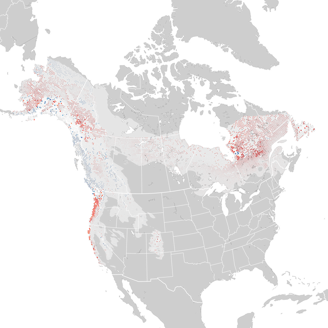

Trends 2012-2022
Сезон размножения, 28 июнь - 19 июль
This map depicts the cumulative change in estimated relative abundance from 2012 through 2022 with circles representing 27km x 27km regions. Red indicates decline and blue indicates increase. The darker the color, the stronger the trend. White circles represent locations where the trend estimate is not significantly different from zero (i.e., the 80% confidence interval contains zero). Circle sizes are scaled by the estimated relative abundance at the middle of the time period.
Дополнительная информацияAbundance Trend
Pct. Change, 2012-2022
-30%-20-10Не точно+10+20+30
LowerHigher
Regional Trend
Range-wide Trend (Confidence Intervals)
80% confidence interval, or range of values where the model is fairly confident the true trend could be, with it being most likely near the median value. Дополнительная информация
-9,6 % Upper
-17,9 % Median
-20,8 % Lower
