
Mapas de Tendências
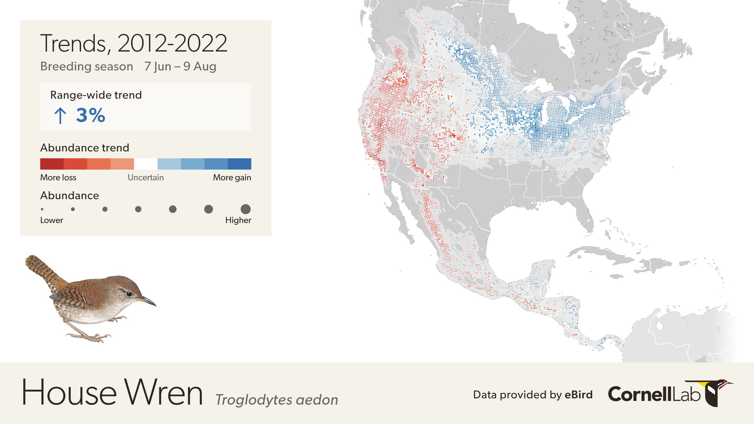
This map depicts the cumulative change in estimated relative abundance for House Wren from 2012 through 2022 with circles representing 27km x 27km regions. Red indicates decline and blue indicates increase. The darker the color, the stronger the trend. White circles represent locations where the trend estimate is not significantly different from zero (i.e., the 80% confidence interval contains zero). Circle sizes are scaled by the estimated relative abundance at the middle of the time period.
A new generation of eBird Trends maps provides an unprecedented fine-scale view of where bird species are increasing or decreasing. Identifying such trends is the crucial first step to begin identifying ways to reverse pervasive declines like the ones identified by the 2022 U.S. State of the Birds report and the State of the World’s Birds.
The maps of population trends for more than 850 bird species are produced by a team of data scientists at the Cornell Lab of Ornithology using bird observations submitted by citizen scientists to the Cornell Lab’s eBird program.
For the first time scientists and practitioners can see exactly where declines or increases are happening at resolutions as small as 27 x 27 km (16.7 x 16.7 miles) region, an area smaller than many counties. The eBird Trends maps can show precisely where research is urgently needed to examine drivers of population declines, as well where conservation measures appear to be working and could be replicated elsewhere.
eBird Trends maps also show changes in bird abundance during different parts of a bird’s life cycle—a critical component that until now has been missing. Seeing how bird abundance changes during different times of the year can help scientists untangle how factors on the breeding or nonbreeding grounds could affect a species.
Thanks to the power of citizen scientists around the world, data scientists at the Cornell Lab can now produce trend estimates for species outside the United States and Canada.
What are eBird Trends maps?
eBird Trends maps show where bird abundance has increased (blue), decreased (red), or where change has been uncertain (white) from specified years within a 27 x 27 km region (represented by a circle). The darker the color, the stronger the trend. The trend shows an estimate of the cumulative percent change in population size from specified years and does not represent annual fluctuations in populations. Regional and state/province level summaries of trends with confidence intervals are available on the right side panel.
Every 27 x 27 km region on the map is also scaled by an estimate of abundance based on abundance data from the midpoint of the period. To see eBird trend estimates for each 27 x 27 km circle place the mouse over the circle. The pop-up shows the median trend with upper and lower 80% confidence bounds. Circles that are larger show where more individuals of a given species occur. Hence, larger and darker red circles indicate that a larger proportion of the population is declining.
eBird Trends are produced using a statistical method designed to account for changes in where people go birding and how the identification and detection skills of birders change over time—factors that can make estimating a population trend challenging. Another novel component of eBird Trends maps is the inclusion of habitat variables that take into account the effect of habitat on population changes.
All of the eBird Trends displayed on the website have passed critical statistical tests to ensure they are robust and reliable. An important part of this process is quantifying the uncertainty of the trend estimate. Uncertainty is quantified by an 80% confidence interval. The 80% confidence interval indicates a range of values expected to contain the true (but unknown) trend that is being estimated. If an interval contains zero, then there is low confidence in the estimated direction of the trend (positive or negative). By default, circles with low confidence in the estimated direction are shown in white. However, for some applications understanding the full spatial pattern of population change can also be valuable to interpret the trends. To see the trends across all locations toggle the “Show All Trends” in the legend. To learn more about how we estimate species’ population trends, please visit the FAQs.
What can we learn from eBird Trends maps?
Detailed snapshot of population health
eBird Trends provides a snapshot of population health for more than 2000 species, allowing practitioners to quickly assess which species need attention and where.
Taking a look at grassland birds, a group that has declined by 34% since 1970 according to the 2022 State of the Birds report, Trends suggests continued decline of many species within the last ten years. Eastern Meadowlarks, for example, have declined by 23% across the United States from 2012 to 2022.
To get a more detailed look at population trends, state/province summaries indicate that Eastern Meadowlarks are rapidly declining in a number of states, with declines greater than 30% in Illinois, Indiana, Arkansas, Mississippi, Alabama, and Wisconsin. This information can help state agencies apply for conservation funding to help reverse the declines.
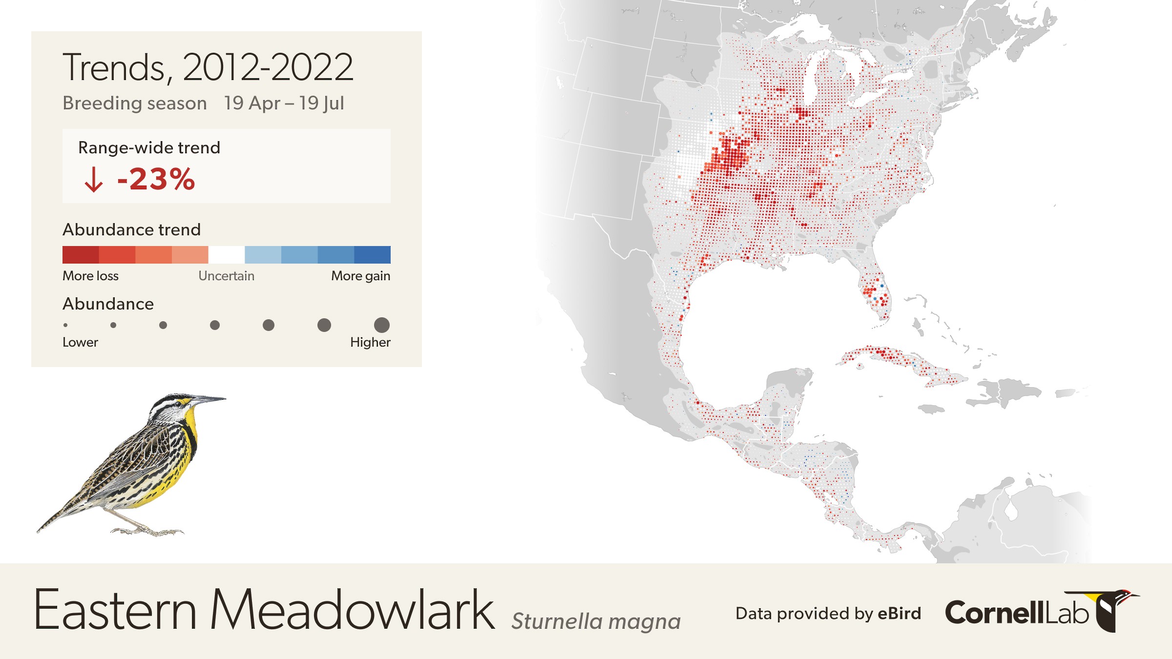
This map depicts the cumulative change in estimated relative abundance of Eastern Meadowlark from 2012 through 2022 with circles representing 27km x 27km regions. Red indicates decline and blue indicates increase. The darker the color, the stronger the trend. White circles represent locations where the trend estimate is not significantly different from zero (i.e., the 80% confidence interval contains zero). Circle sizes are scaled by the estimated relative abundance at the middle of the time period.
Regional variation in detail
eBird Trends maps also highlight the fact that population change is not equal throughout a species’ range. State or regional estimates of populations are useful, but can fall short when local changes affect species. This can make it challenging to assess where on the landscape to examine the drivers of population changes. The new eBird Trends maps are a breakthrough for research and conservation at relevant scales.
Wood Thrush populations, for example, show large regional variation, with a patchwork of increases and decreases. The first question that comes to mind when looking at the Wood Thrush Trends map is why are they increasing in the Appalachian region but decreasing in the Mid-Atlantic and southern New England states?
In West Virginia for example, Wood Thrushes increased by 20% from 2012 to 2021, but in Massachusetts they declined by 24% over the same period. The regional trend states (on the right side panel) also show the 80% confidence interval—an upper and lower value expected to contain the true (but unknown) trend that is being estimated. Hence, in this example, our best estimate of the trend is 20% but it could be as low as 10% and as high as 28%.
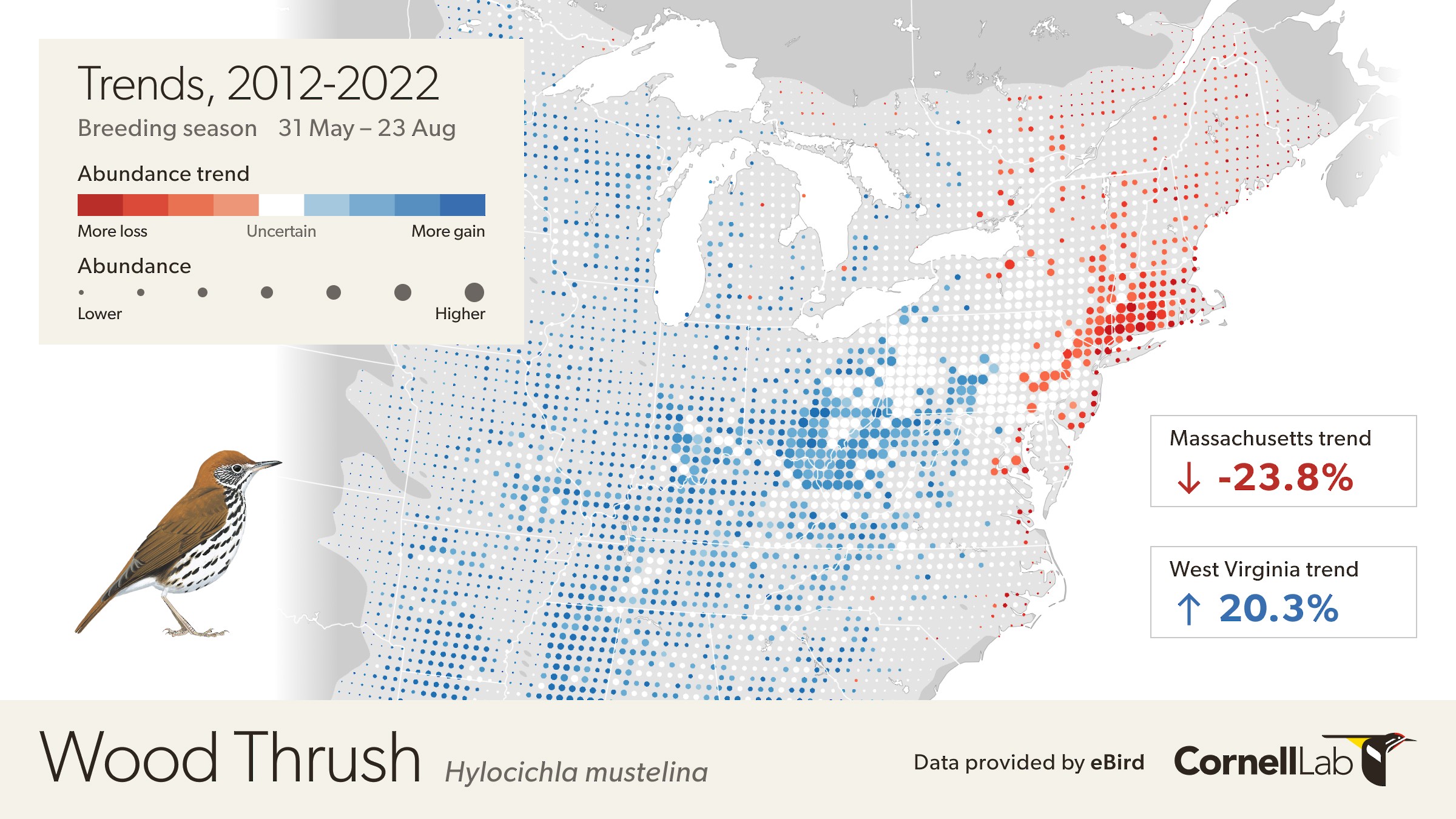
This map depicts the cumulative change in estimated relative abundance for Wood Thrush from 2012 through 2022 with circles representing 27km x 27km regions. Red indicates decline and blue indicates increase. The darker the color, the stronger the trend. White circles represent locations where the trend estimate is not significantly different from zero (i.e., the 80% confidence interval contains zero). Circle sizes are scaled by the estimated relative abundance at the middle of the time period.
Coincidentally, in the last decade, the Appalachian Mountains Joint Venture (AMJV)—a partnership of over 50 federal, state, and nonprofit organizations from Alabama and Georgia to New York—implemented forest management projects to restore the age and structural diversity of hardwood forests in the region. These conservation measures have the potential to improve populations of forest-dwelling songbirds and may help explain increases in Wood Thrushes in the region.
With details like these scientists can examine conservation actions happening in the Appalachian Mountains Joint Venture and seek to replicate them in other parts of the species range.
Hyper local estimates
eBird Trends provides estimates at smaller scales relevant for conservation, a critical component for developing conservation plans, particularly for sensitive species.
The Greater Sage-Grouse has lost 50% of their population since 1970 and are at risk of losing another half of their remaining population if nothing changes, according to the 2022 U.S. State of the Birds Report. Conversion of sagebrush-dominated shrub-steppe habitat and disturbance have led to population declines, but identifying where to focus conservation efforts can be challenging. eBird Trends present a more comprehensive snapshot of population health by allowing us to visualize changes in abundance at local scales. These maps help pinpoint exactly where populations are decreasing and increasing to help identify where to focus conservation efforts. Areas with greater numbers of individuals (larger circles) that are also darker red mean a larger proportion of the population has experienced a decline of a greater magnitude such as in Wyoming. In Wyoming Greater Sage-Grouse populations have declined by 30% from 2012 to 2022, but in Montana where there are also larger numbers of individuals populations have increased by 14%. Zooming in more on Montana tells us that while populations are increasing overall, a few locations are showing decreases. These locations could be candidates for conservation action and have the potential to provide a good return on conservation investments because a larger percent of the population (larger dot) also occurs in the area.
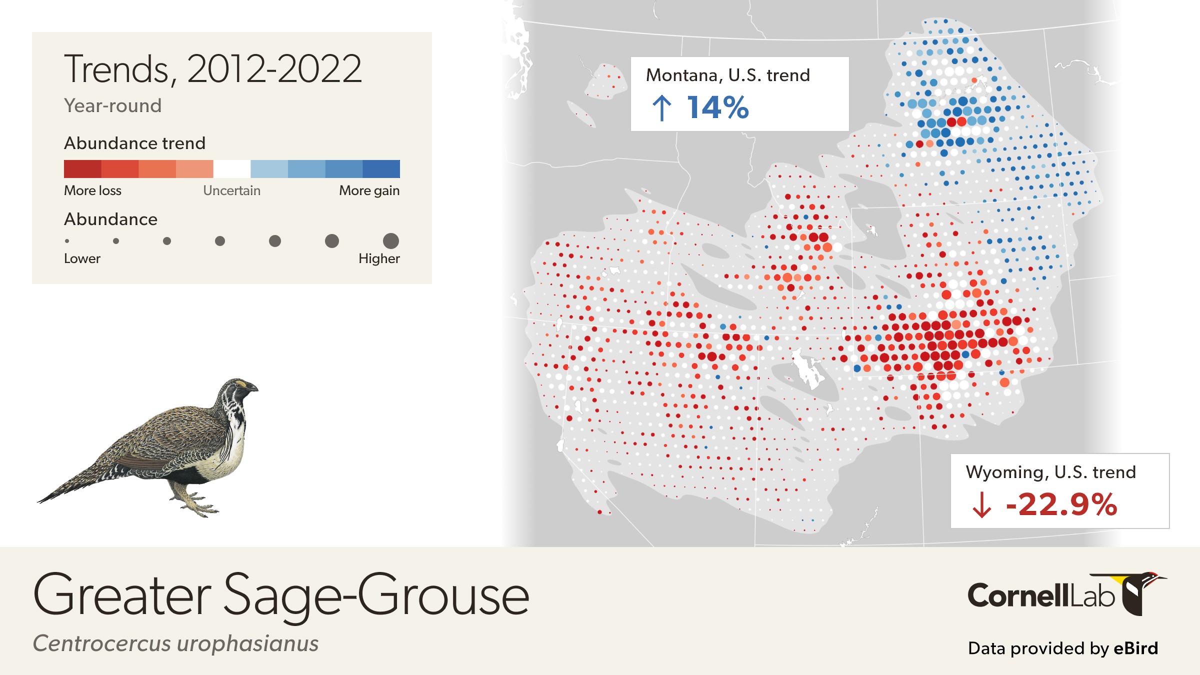
This map depicts the cumulative change in estimated relative abundance for Greater Sage-Grouse from 2012 through 2022 with circles representing 27km x 27km regions. Red indicates decline and blue indicates increase. The darker the color, the stronger the trend. White circles represent locations where the trend estimate is not significantly different from zero (i.e., the 80% confidence interval contains zero). Circle sizes are scaled by the estimated relative abundance at the middle of the time period.
Early warning signs
American Robins are often seen as a ubiquitous harbinger of spring, but the eBird Trends maps paint a different story of patterns of abundance during the breeding season.
During the breeding season, the abundance of American Robins has declined by 5% in the United States, with stronger declines occurring in the midwest.
At first glance, the large swaths of red are shocking. How could it be that American Robins, which seem to be everywhere, could be declining so much throughout their range? Observing changes in abundance can be hard to see in real time, especially if changes are occurring slowly year after year. But slow declines add up and the eBird Trends maps are a real wake-up call. The declines observed during the breeding season highlight a need to study populations, especially in the darkest red areas.
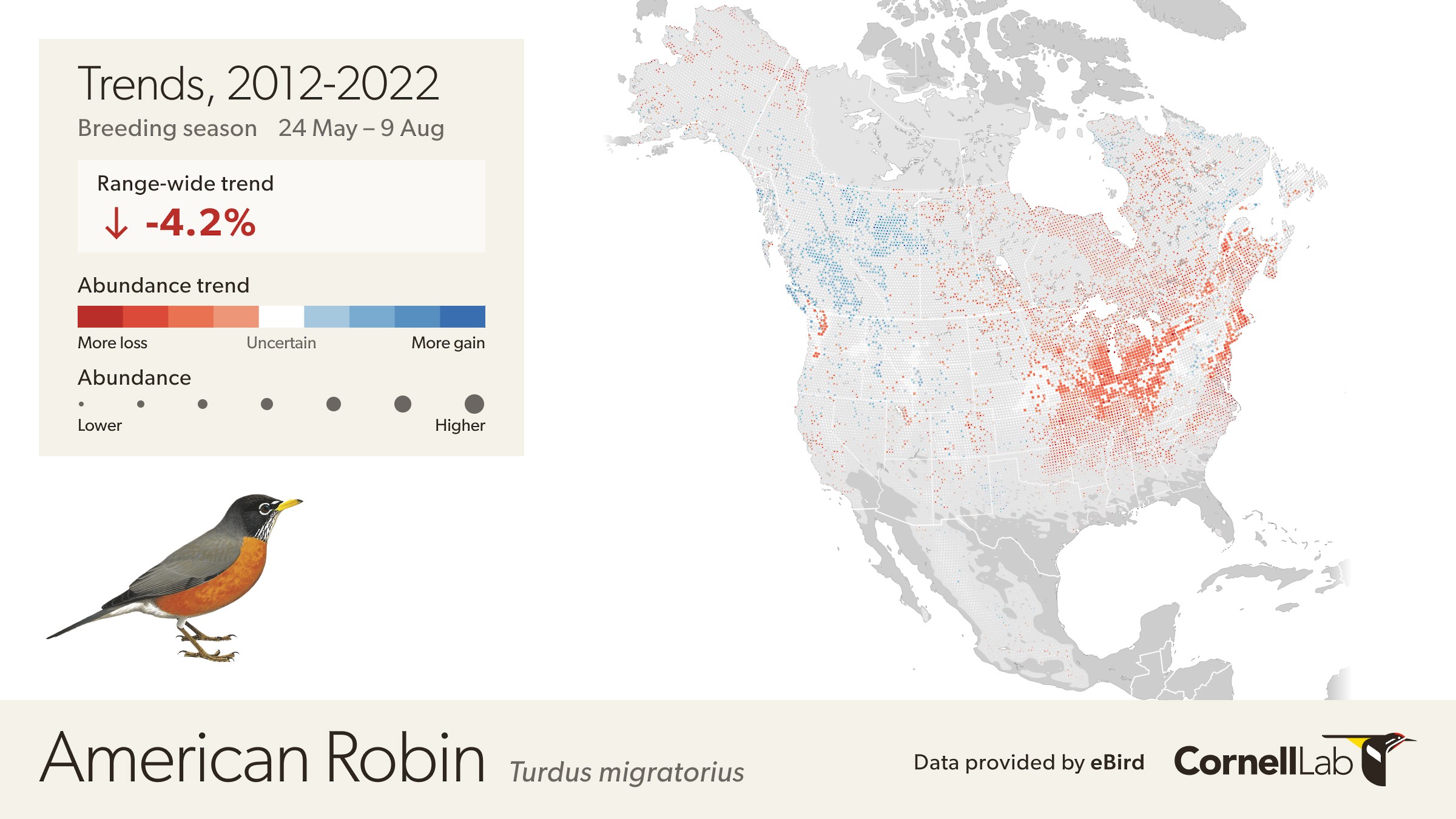
This map depicts the cumulative change in estimated relative abundance for American Robin from 2012 through 2022 with circles representing 27km x 27km regions. Red indicates decline and blue indicates increase. The darker the color, the stronger the trend. White circles represent locations where the trend estimate is not significantly different from zero (i.e., the 80% confidence interval contains zero). Circle sizes are scaled by the estimated relative abundance at the middle of the time period.
Range shifts
As our climate continues to change eBird Trends maps may show indications of range shifts or expansions. The Northern Cardinal appears to be increasing at the ends of its range in the west and in the north. At the western edge of their range, for example, Northern Cardinals increased 13% in the last ten years in Texas and Oklahoma and by 21% in Kansas. Whether these shifts are due to climate change or not needs further study, but eBird Trends provides food for thought to allow researchers to take a closer look.
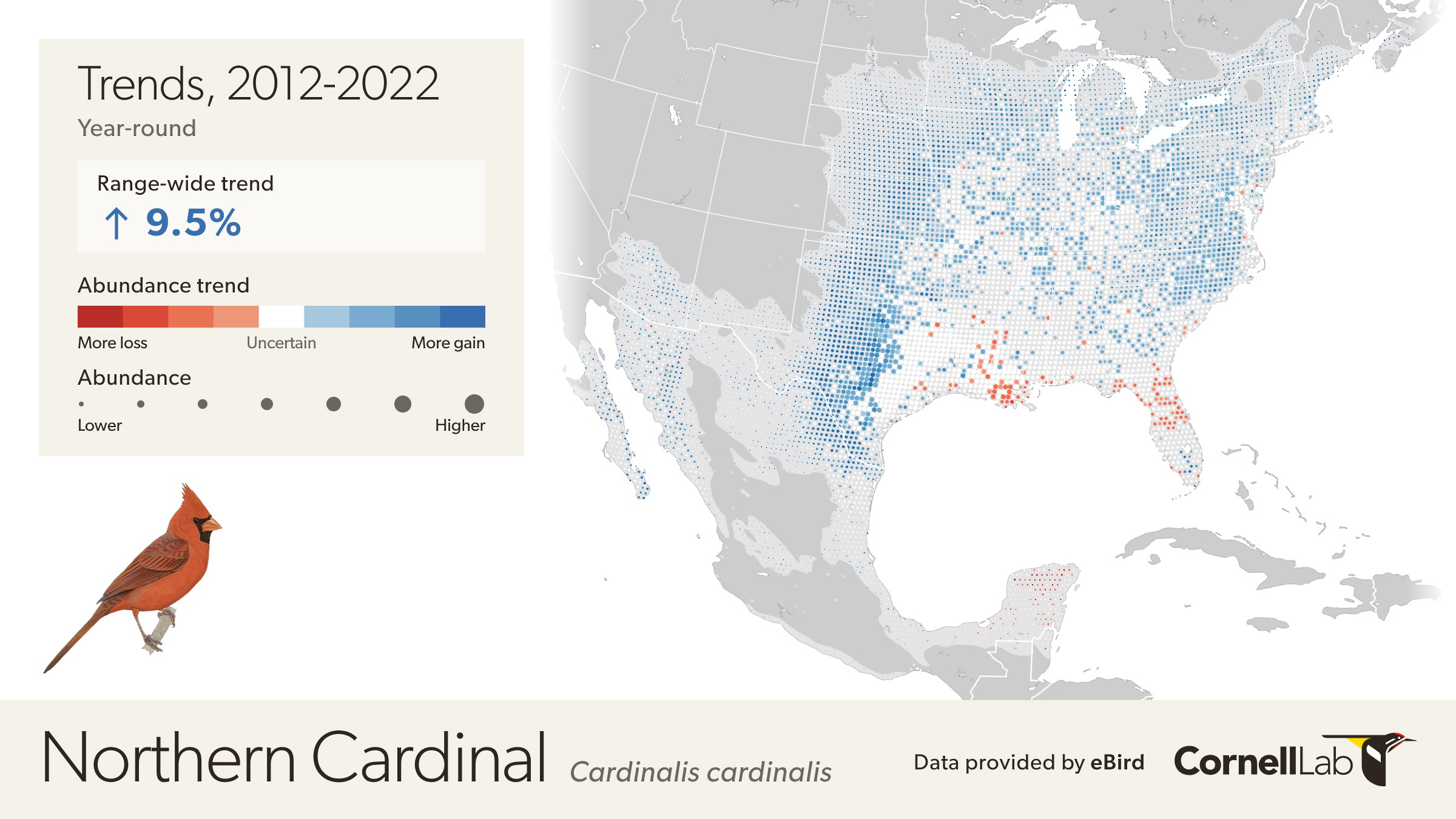
This map depicts the cumulative change in estimated relative abundance for Northern Cardinal from 2012 through 2022 with circles representing 27km x 27km regions. Red indicates decline and blue indicates increase. The darker the color, the stronger the trend. White circles represent locations where the trend estimate is not significantly different from zero (i.e., the 80% confidence interval contains zero). Circle sizes are scaled by the estimated relative abundance at the middle of the time period.
Global assessments
As the number of people participating in eBird has increased over the years, so too has our ability to predict status and trends of species around the globe. Thanks to the global participation in eBird, we can now visualize changes in abundance for species outside the United States and Canada.
The Long-tailed Meadowlark is a common and widespread inhabitant of open country in lowlands and middle elevations in Argentina and Chile. Thanks to our partners and eBirders observations of Long-tailed Meadowlarks were robust enough to allow for trends analysis from 2015-2022 within 27 x 27 km regions throughout the meadowlark’s range. Overall, the Long-tailed Meadowlark has declined by 5% in the last ten years, but in the Buenos Aires province of Argentina, the Long-tailed Meadowlark increased by 39%.
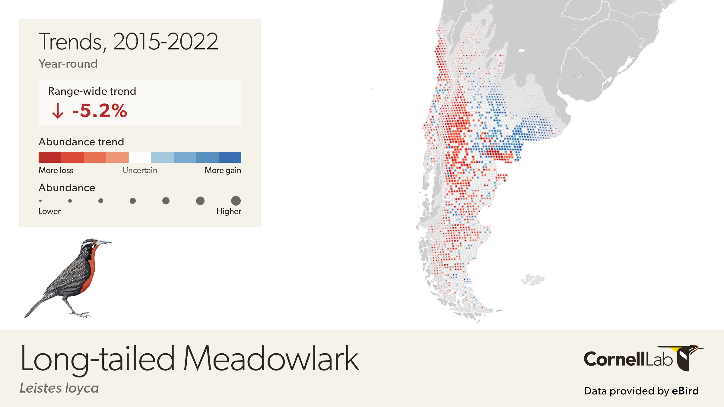
This map depicts the cumulative change in estimated relative abundance for Long-tailed Meadowlark from 2012 through 2022 with circles representing 27km x 27km regions. Red indicates decline and blue indicates increase. The darker the color, the stronger the trend. White circles represent locations where the trend estimate is not significantly different from zero (i.e., the 80% confidence interval contains zero). Circle sizes are scaled by the estimated relative abundance at the middle of the time period.
What are the trends for the white circles on the map?
By default, circles where there is low confidence in the estimated direction of population change are shown in white. However, for some applications understanding the full spatial pattern of population change can also be valuable to interpret the trends. To see the trends across all locations toggle the “Show All Trends” in the legend.
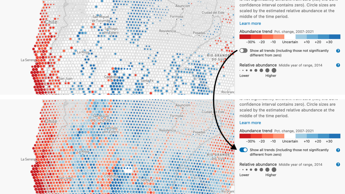
To see all trends, including those not significantly different from zero toggle the bar in the legend to “Show all trends.”
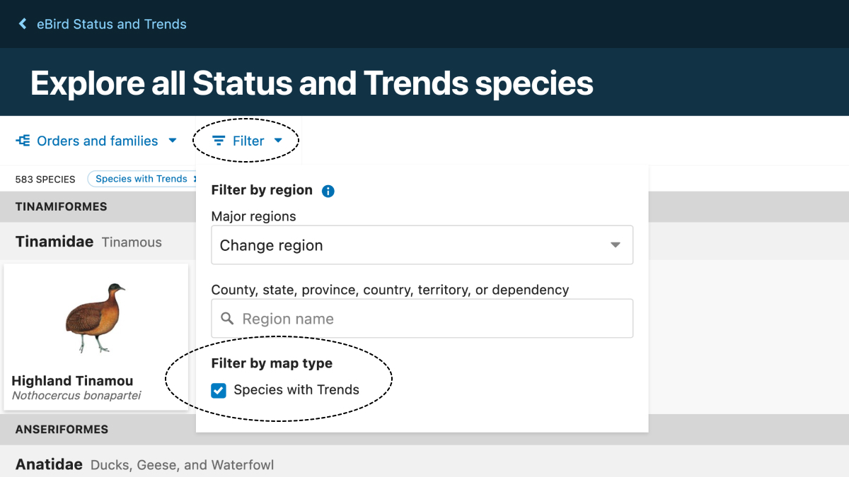
How do I find species with eBird Trends maps?
eBird Trends maps bring the data front and center—all you need to do is pick a species for which eBird Trends are available.
From the eBird Status and Trends homepage, click on the green explore button. Next tap the down arrow next to the word “Filter” and then click the “Species with trends” box under filter by map types. Click on the photo of any species to see eBird Trends as well as weekly abundance visualizations and range maps. You can easily move between Abundance, Weekly, Trends, and Range visualizations using the menu at the top.
Learn more about trends and download data
To learn more about eBird Status and Trends data products visit our frequently asked questions.
Get information about how to download and analyze the data at our site about using eBird data.