
מפות שפע שבועיות
The eBird Status and Trends abundance animations reveal migratory pathways and when and where species occur—all to help guide conservation and power your birding experience.
Migratory pathways
eBird Status and Trends animations visualize the changes in abundance at weekly intervals shedding light on continental-scale patterns for more than 2,000 species. Identifying changes in abundance throughout the full annual cycle is an aspect that was previously difficult to pinpoint for more than a few individual species. And knowing the locations where bird populations are most likely to occur throughout the year is critical to be able to protect the right places at the right time.
Watch the journey of Barn Swallows, a bird found darting over fields and lakes, from South America to Canada. The detail and information in the visualizations is breathtaking. Not only can we see how Barn Swallows move, we can see where they are most common, and we can see a different population in South America that migrates from Argentina to Venezuela and back.
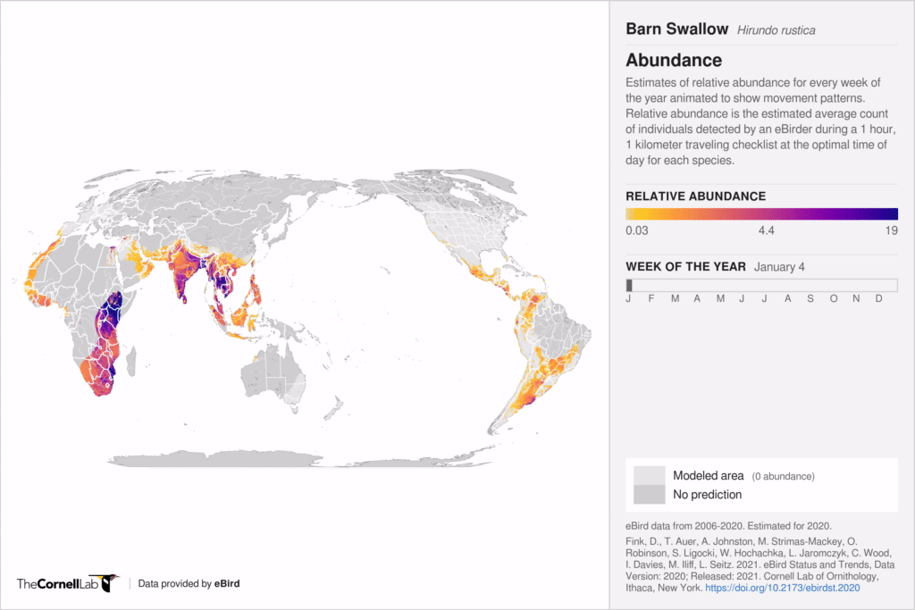
Estimates of relative abundance for Barn Swallows for every week of the year animated to show movement patterns.
These stunning visualizations are the result of years of computation and statistical analyses led by the Cornell Lab using eBird data to produce a level of detail on bird abundance across the hemisphere that was not possible until recently.
Abundance animations also reveal novel migratory pathways. Gray-cheeked Thrushes migrate to northern South America during the winter months and most experts believed that they returned to the breeding range by passing over the Gulf of Mexico or along the Central American coast. Additional research that is also backed up by abundance animations reveal that Gray-cheeked Thrushes first move up into the Andes in late February to early March before making the journey north. Places like the Sierra Nevada de Santa Marta in Colombia are now known to be key refueling points for Gray-cheeked Thrushes as they migrate north.
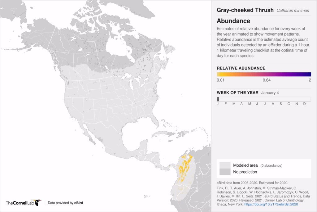
Estimates of relative abundance for Gray-cheeked Thrush for every week of the year animated to show movement patterns.
When and where species occur
Take a look at how Shining Bronze-Cuckoos move around Australia and New Zealand. The state-of-the-art statistical models combined with eBird data highlight exactly where and when Shining Bronze-Cuckoos turn up. In January, Shining Bronze-Cuckoos start leaving Western Australia, heading towards Indonesia, but return in August. And in September, Tasmania and the north island of New Zealand start seeing the metallic-looking inhabitants of woodlands that are returning from New Britain and the Solomons. The details resulting from the statistical models and eBird data not only can help you find more birds, but these visualizations can help us better understand movement patterns and identify when specific regions may be most important for conservation.
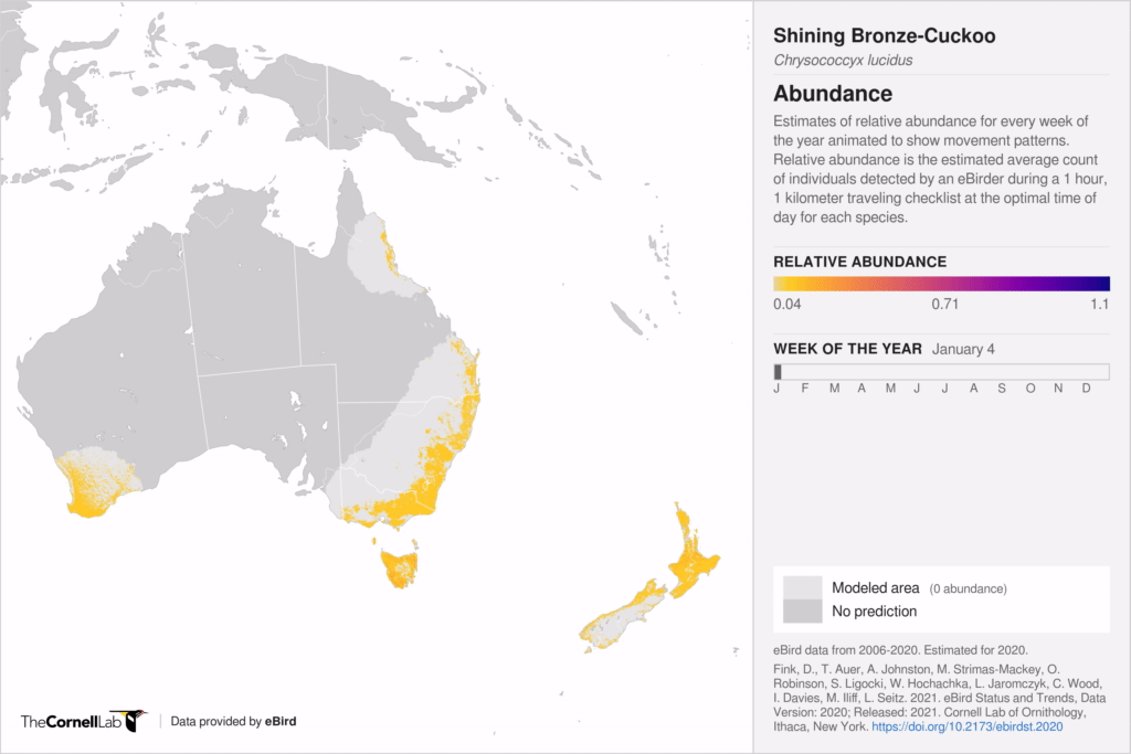
Estimates of relative abundance for Shining Bronze-Cuckoo for every week of the year animated to show movement patterns.
Guide conservation
Cerulean Warbler © Brad Imhoff /Macaulay Library
Not only can we see migratory pathways, these predictive models inform where to direct conservation efforts. A team of scientists including researchers from the Cornell Lab of Ornithology used the Status and Trends abundance results to determine how much land is needed to protect 117 migratory songbirds throughout the entire year. With abundance results spanning the entire annual cycle of a bird, the team showed where additional lands need to be protected to achieve conservation of at least 30% of the population. The team also found that conservation can be achieved at a lower cost by including areas with shared human uses such as agricultural landscapes in conservation plans.
Data on when and where birds are expected to occur every week of the year at a fine spatial scale helps guide more flexible conservation solutions to accommodate human and ecological needs. For example, “if we know precisely when and where birds are nesting in hayfields, we can design conservation interventions—like postponing mowing—to help birds while minimizing impacts to farmers,” says Amanda Rodewald, Garvin Professor and director of the Center for Avian Population Studies at the Cornell Lab. Leveraging fine-scale data with state-of-the-art statistical models, Rodewald says, “gives us more options to conserve species while accommodating human needs.”
eBird Status and Trends visualizations also inform policy decisions. The United States Fish and Wildlife Service turned to eBird Status and Trends weekly abundance estimates to define low risk zones for wind energy development. The U.S. Fish and Wildlife Service needed to better understand where Bald Eagles were most likely to be throughout the year to reduce the potential risk of collision from wind energy projects. eBird Status and Trends visualizations provided the most complete and accurate picture to help them inform policy decisions at the federal level.
Build knowledge
We’ve all heard that “the early bird gets the worm” and early arriving males do often get the best territories. But the timing of migration is a complex web of interactions that can affect reproductive success and survival both positively and negatively. Abundance animations can shed new light on timing of migration questions to help us better understand how climate change may be impacting the timing of migration.
Wilson’s Warblers breed across the boreal forest, along the west coast, in the intermountain west, and in the north west corner of the United States; and winter throughout Mexico and Central America. Abundance animations reveal different timing of migration for the eastern and western populations. The western population heads up the Pacific Flyway as early as March while the eastern population stages in Mexico and Central America a bit longer, heading north in late April/early May. The reasons why timing differs between the two populations is unclear, but if they arrive on the breeding grounds too early or late there could be repercussions for survival due to mismatches in food availability, predator abundance, or amount of vegetation that can offer protection from predators.
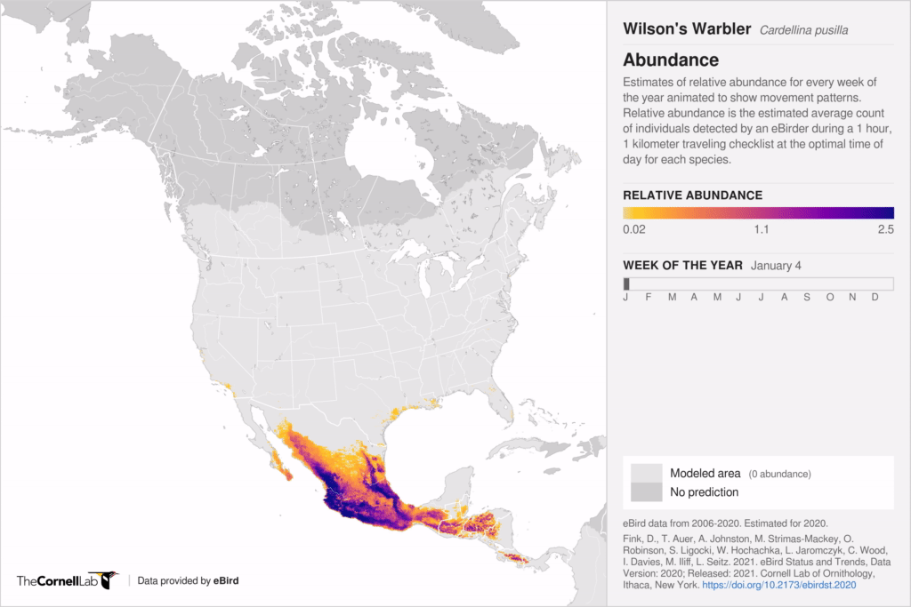
Estimates of relative abundance for Wilson's Warbler for every week of the year animated to show movement patterns.
Map Key
Relative abundance is the estimated number of individuals for a given site that could be detected by an eBirder during a traveling count at the optimal time of day for each species. Relative abundance is depicted as a color gradient from yellow (low abundance) to dark purple (high abundance) for every week of the year. Press play to watch movement patterns over the entire year or click the arrows at the bottom of the map to advance week by week. Areas of light gray indicates species absence (or very rare occurrence). Areas of dark gray indicate areas in which predictions could not be made due to lack of data.